
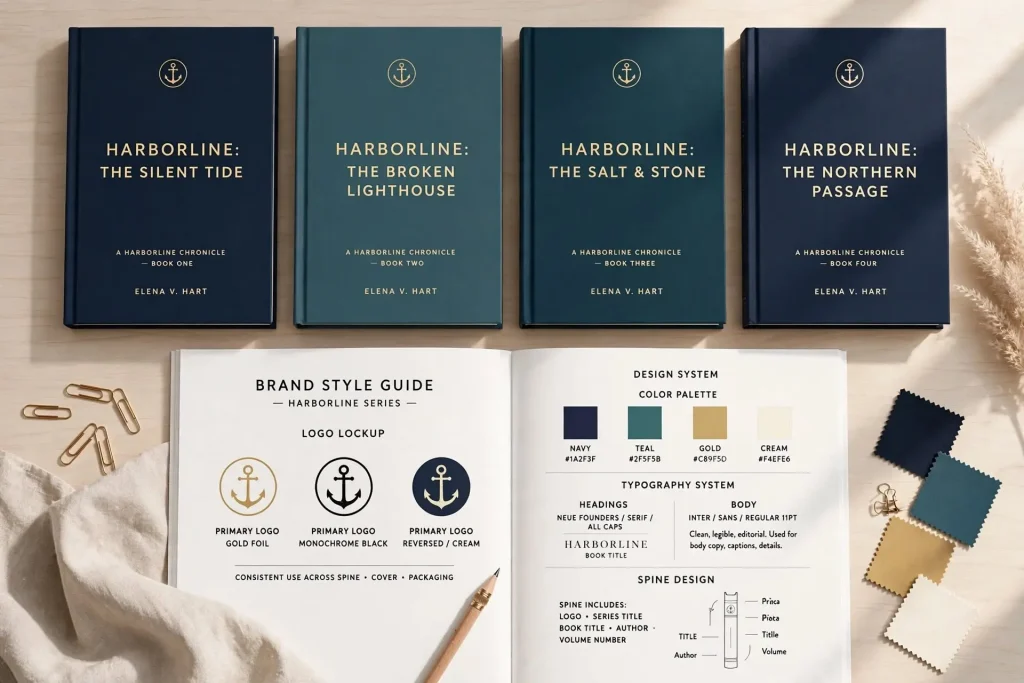
Most authors get the first book’s branding roughly right and then watch the consistency fall apart across subsequent releases. The second book uses different fonts on the cover. The third book has a different color palette. The series uses one design system for the first three books and a slightly different one for books four and five. The website, social media, and email all use slightly different visual identities. Readers experience the catalog as a collection of related but visually disconnected works rather than as a coherent author brand. The book branding consistency that produces strong author recognition isn’t accidental. It comes from deliberate decisions about visual systems and the discipline to maintain those systems across years of releases.
This post walks through what brand consistency actually means for authors, the specific elements that need to stay consistent, and how to build systems that maintain consistency as the catalog grows.
What Brand Consistency Actually Means
Brand consistency is the visual and conceptual continuity that lets readers recognize your work across multiple touchpoints.
The recognition function. Readers who enjoyed one of your books should recognize your other books immediately. A reader scrolling Amazon should see one of your books in a list of search results and know it’s yours before reading the title or author name.
The credibility function. Consistent branding signals professional production. Authors who maintain coherent visual identity across multiple books look like serious professionals. Authors with scattered branding look like beginners who haven’t thought through their brand.
The discoverability function. Strong brand consistency improves cross-discovery between books. Readers who finish book one and recognize the visual identity of book two are more likely to investigate.
The trust function. Consistency signals that the author cares about the work and treats the catalog as a serious body of work. The trust transfers to expectations about the writing itself.
Inconsistency damages all of these functions. Books that don’t recognizably belong to the same author waste the brand equity each book could be contributing to.
Visual Elements That Need Consistency
Several specific visual elements need to stay consistent across the catalog.
Cover design system. The covers should share a recognizable design system even when individual covers differ. Same font families for titles. Similar color palette across the catalog. Consistent treatment of author name. Same visual aesthetic for the overall style.
Author name treatment. Your name should appear in the same font, position, and styling across every book. Readers shouldn’t see your name in a script font on one book and a sans-serif on another.
Spine design. For print editions, the spine treatment should be consistent so books look right side by side on a shelf.
Author photo. The same author photo (or photos in the same style) across multiple touchpoints. Suddenly different photos in different places fragment the brand.
Color palette. A defined set of colors used across covers, website, social media, and marketing materials. Random color choices in different places undermine recognition.
Typography. The fonts used for covers, website, marketing materials, and email should connect rather than feel random. A defined typography system makes everything feel intentional.
Visual mood. The overall feel of your visual presentation should be consistent. Books, website, social media, and email should all signal the same brand personality.
Series Specific Branding
For series authors, the series itself needs visual identity that connects books while differentiating individual entries.
Series visual template. A defined design system for series covers. Same typography style. Same general composition approach. Same color palette guidelines. Each book follows the template while showing its own specific content.
Series numbering or naming visible. Readers should be able to tell quickly that books belong to a series and in what order. Numbers, subtitle conventions, or other visible series indicators all work.
Connected but different. Series books should clearly belong together but each should have its own visual personality. Books that look identical confuse readers. Books that look entirely different fail to signal the series connection.
The visual evolution. Some series evolve visually over time as the author’s brand matures or trends shift. Major visual shifts should happen at logical breakpoints (the start of a new arc, a major series milestone) rather than randomly between books.
Cover redesigns. Some authors eventually redesign earlier series covers to match the updated visual identity established by later books. The redesign produces catalog coherence at the cost of breaking continuity for early adopters who already owned the old covers.
Cross Format Consistency
The same book in different formats needs visual continuity across the formats.
Cover treatment across formats. Ebook, paperback, hardcover, and audiobook all need cover art. The art should be the same design across formats, adjusted for the specific format requirements.
Hardcover vs paperback variations. Hardcover covers sometimes include dust jacket designs that differ from paperback. The dust jacket design should still feel like the same book.
Audiobook cover sizing. Audiobook covers need to work at square aspect ratios and small thumbnail sizes. The design should adapt while maintaining recognition.
Print interior consistency. The interior typography and layout should match across editions. Different fonts or layouts in different print editions of the same book confuse readers.
Ebook conversion fidelity. The ebook should preserve the visual identity established by the cover and interior design as much as the format allows.
For most authors, working with a single designer or design system across all formats produces better consistency than treating each format separately.
Catalog Wide Visual System
Once you have multiple books, the catalog as a whole has visual identity beyond any individual book.
The collected appearance. When all your books appear together in marketing materials, on your website, or in author profiles, they should look like a coherent collection. Random visual variation makes the catalog look accidental.
Catalog promotional graphics. When you produce marketing graphics featuring multiple books, the books should sit comfortably together rather than fighting each other visually.
Boxed sets and bundles. Boxed sets pull multiple covers together into a single product. The cover designs need to work together visually. Books with inconsistent design produce boxed sets that look thrown together.
Series overview graphics. Graphics showing all books in a series should produce visual harmony rather than disparate impressions.
The catalog visual system is the cumulative result of individual book design decisions. Authors who plan their catalog visual identity early in their careers produce better catalog appearance than authors who let it emerge accidentally.
Maintaining Consistency Across Years
The hardest brand consistency challenge is maintaining coherence over years of releases as trends shift and your taste evolves.
Document your brand system. Write down the specific colors, fonts, treatments, and other visual standards. Reference the document for each new book to maintain consistency.
Work with consistent designers. The same designer (or design team) across multiple books produces better consistency than rotating designers. The designer learns your brand and maintains it across projects.
Resist trend chasing. Cover design trends shift every few years. Authors who follow each trend produce catalogs that look like geological layers of different eras. Stick to your established system unless the change is intentional and applied across the catalog.
Update strategically when needed. Sometimes brand evolution is appropriate. Major career transitions, genre shifts, or specific strategic decisions justify visual updates. When updates happen, apply them across the catalog rather than just to new releases.
Resist personal taste changes. As you live with your brand for years, you may start to dislike specific elements. Resist changing things just because your personal taste evolved. The brand serves readers, not your current aesthetic preferences.
Beyond Visual Branding
Brand consistency extends beyond visual elements to other aspects of how readers experience your work.
Voice consistency in marketing. The voice of your email newsletter should match the voice of your social media which should match the voice of your book descriptions. Random voice variation across channels fragments the brand.
Topic consistency. The topics you discuss across content should fit a recognizable brand. Authors who suddenly start posting about unrelated topics confuse audiences about what their brand stands for.
Quality consistency. The quality bar for each book in the catalog should match. Books with significantly different quality levels damage reader trust. Either maintain consistent quality or signal clearly when you’re doing something different.
Series world consistency. For series authors, the world details, character behaviors, and tone should stay consistent across books. Major shifts that aren’t explained in the story confuse readers who’ve followed the series.
Author persona consistency. The way you present yourself across interviews, social media, and other public touchpoints should be recognizably the same person. Wildly different personas in different contexts confuse audiences.
Consistency in Practical Marketing Materials
The marketing materials around your books need consistency that matches the books themselves.
Email template design. Your newsletter should use design elements that match your book branding. Same fonts. Same color palette. Same general aesthetic.
Social media profile and content. Profile photos, banner images, and content style should all reinforce your established brand.
Website design. Your author website should use the same design system as your books and other marketing. Random website design that doesn’t connect to your books fragments the brand.
Promotional graphics. Sale announcements, book mockups, social media posts about books should all feel like they come from the same source as the books themselves.
Press materials. Your media kit, sales sheets, and other professional materials should use the same visual system as your other materials.
Authors who maintain this kind of cross-touchpoint consistency produce brands that feel intentional and professional. Authors who use different design for different purposes produce brands that feel fragmented even when individual pieces look fine.
Common Branding Consistency Mistakes
Several patterns regularly damage author brand consistency.
Different designers for different books. Random designer choice produces random brand outcomes. Either stick with one designer or maintain strict brand guidelines that any designer must follow.
Trend chasing on individual books. Following the current design trend on the latest book while older books used different conventions produces visible inconsistency.
Updating only new books. Visual evolution that applies only to new books while older books keep the older style produces catalogs that look like multiple authors wrote them.
Ignoring format adaptations. Letting each format (ebook, print, audiobook) get its own design treatment instead of adapting a single design.
Random platform variations. Different banner designs on Instagram than Facebook. Different profile aesthetics on different platforms. The fragmentation undermines brand recognition.
Personal taste drift. Letting your evolving personal aesthetic preferences change brand elements without strategic reason.
No documented brand standards. Authors without written brand guidelines often produce inconsistent execution even when they want to maintain consistency.
Skipping the audit. Authors who don’t periodically audit their entire catalog for consistency miss the drift that accumulates over years.
Brand Discipline as the Long Path to Recognition
Author brand recognition builds slowly through consistent execution across years. The author whose books look the same way they did three years ago, but produced more of them, builds stronger recognition than the author who experimented with different design directions across the same period. The discipline to maintain consistency feels limiting in the moment when each new book offers an opportunity to try something new. The cumulative effect of that discipline produces brands readers actually recognize.
Most authors who eventually build strong recognized brands look back at their early books and want to change things. The visible inconsistency between their first books and later books is itself the visible record of brand inconsistency that they didn’t avoid early. The authors who carry consistent brand standards from book one onward, even when they didn’t have all the resources or experience their later books had, tend to produce catalogs that build recognition steadily across years. Brand discipline isn’t glamorous, but the compound effect across an entire career produces author brands that readers find unmistakable.


