
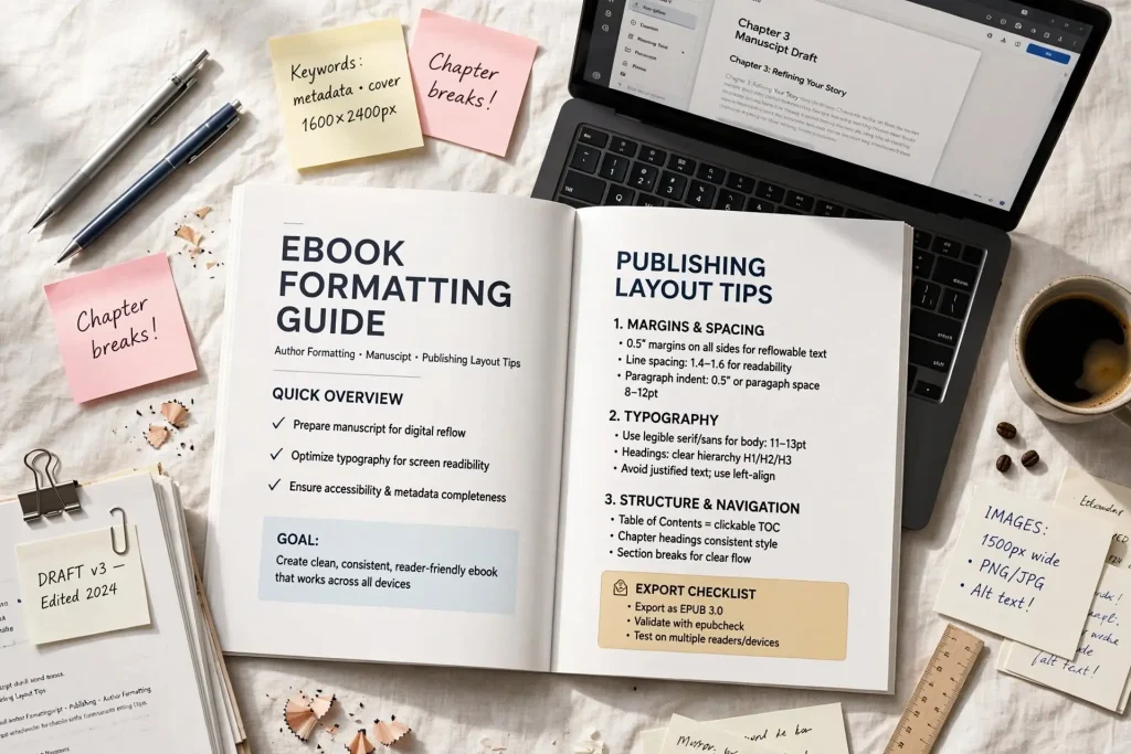
Most authors approach ebook formatting by trying to make Word documents work as ebooks. They write in Word, save as some kind of ebook file, and hope the result looks acceptable. The output often has formatting problems readers find frustrating: text rendering oddly across devices, broken navigation, images that don’t display properly, fonts that change unexpectedly. The ebook formatting guide that actually helps authors involves specific practices that produce clean files across reading platforms rather than Word workflows that produce inconsistent results.
This post walks through what professional ebook formatting involves, the specific elements that affect file quality, and how to build a workflow that produces ebook files readers can enjoy without distraction.
What Professional Ebook Formatting Looks Like
Professional ebook formatting produces files that work consistently across reading platforms.
Clean reflow behavior. Text adjusts to different screen sizes without breaking. Lines wrap properly. Paragraphs maintain structure regardless of device.
Consistent typography. Fonts, sizes, and spacing remain consistent throughout the book. Chapter titles look the same across all chapters. Body text formats identically across all pages.
Working navigation. The table of contents links work. Chapter navigation functions correctly. Cross-references operate properly.
Proper image display. Images appear at appropriate sizes. They don’t break page flow. Captions stay associated with their images.
Functional metadata. Title, author, and other metadata appear correctly in reader libraries. Cover images display properly.
Platform compatibility. Files work on Kindle, Apple Books, Kobo, Google Play Books, and other major platforms without modification.
Accessibility support. Screen readers can interpret the content. Semantic markup supports assistive technologies.
These quality markers separate professional from amateur ebook files. Readers may not articulate what’s wrong with poorly formatted files but they notice the friction during reading.
Working With Styles Properly
Style-based formatting is the foundation of clean ebook files.
The styles versus direct formatting distinction. Direct formatting (selecting text and applying bold, italics, font changes individually) produces inconsistent output. Styles (paragraph and character styles applied semantically) produce consistent output.
Heading styles for structure. Use Heading 1 for chapter titles, Heading 2 for sections, Heading 3 for subsections. The semantic structure supports navigation and accessibility.
Paragraph styles for body content. Body text, first paragraphs, scene breaks, block quotes should each use specific paragraph styles. Direct formatting of individual paragraphs breaks down across devices.
Character styles for inline elements. Italics, bold, emphasis should use character styles rather than direct formatting. The styles propagate consistently across the file.
Consistent style application. Apply the same styles to the same content types throughout the book. Inconsistent style application produces inconsistent output.
Avoiding manual line breaks. Use paragraph styles to control spacing rather than manual line breaks. The line breaks may render incorrectly across devices.
Style cleanup before export. Remove unused styles before generating ebook files. Clean style lists produce cleaner output.
Tools like Vellum and Atticus handle styles automatically. Authors using Word need to apply styles deliberately rather than relying on direct formatting.
Navigation File Setup
Navigation files allow readers to move through ebooks efficiently.
The table of contents requirement. Every ebook should have working table of contents. Most platforms require it. Readers expect it.
The TOC types. Most ebooks have two TOC structures: the embedded TOC that appears as a section of the book, and the navigation TOC that appears in reader app menus.
Auto-generation versus manual creation. Most ebook formatting tools auto-generate TOCs from heading styles. Manual TOC creation usually produces problems.
The depth consideration. Most ebooks include H1 and H2 headings in TOC. Going deeper (H3 and beyond) often produces overly busy TOCs.
The chapter linking. TOC entries should link directly to chapter starts. Broken links frustrate readers significantly.
The front matter inclusion question. Some authors include front matter in TOC (title page, copyright, dedication). Others include only main content. Either approach works if consistent.
The series consideration. Books in series benefit from consistent TOC structure across all books in the series.
Navigation file errors are among the most common ebook formatting problems. Proper setup at file creation prevents the issues that catch readers off guard.
Image Handling for Ebooks
Images in ebooks need specific handling that differs from print images.
The resolution requirements. Ebook images need 150-300 PPI for decent display. Print resolution (300+ DPI at print size) usually exceeds what ebooks need but works.
The file size considerations. Large images bloat ebook files. Optimize images for screen display rather than using print-resolution sources directly.
The format choices. JPEG works for photographs. PNG works for graphics with transparent backgrounds or sharp edges. Avoid bitmap formats.
The placement options. Images can be inline (within text flow) or block (between paragraphs). The placement affects how reflow handles them.
The caption handling. Image captions should be styled consistently and stay associated with their images during reflow.
The accessibility requirement. Images need alt text for screen reader support. The alt text describes the image for readers who can’t see it.
The grayscale versus color decision. Most Kindle devices display grayscale. Color images appear in grayscale on these devices. Account for this in image selection.
The image-as-text avoidance. Don’t put readable text inside images. Text should be actual text. Text in images breaks across screen sizes and can’t be read by screen readers.
Image handling affects file quality across every page that includes images. Sloppy image handling produces noticeable quality problems.
Table Formatting
Tables in ebooks require specific handling.
The reflow challenge. Tables don’t reflow cleanly on small screens. Wide tables become unreadable on phones.
The semantic table approach. Use proper table markup rather than visual tables created with tabs or spaces. The semantic markup supports accessibility.
The simple table preference. Involved tables (merged cells, nested tables) often produce display problems. Simpler tables work better in ebook formats.
The image table alternative. For very involved tables that can’t be simplified, image versions sometimes work better than text tables. Trade-off: loses text accessibility.
The list alternative. Some tables work better as lists or descriptive paragraphs in ebook contexts. The format change supports reading on small screens.
The fixed-layout option. For genuinely table-heavy content, fixed-layout EPUB or PDF may be better than reflowable formats.
The platform-specific testing. Test tables on phones specifically. Tables that look fine on tablets may fail on phones.
Tables are one of the most challenging elements to format well in ebooks. The challenge increases with table complication.
Front Matter Setup
The book’s opening pages deserve careful formatting attention.
The title page. Should appear clean and professional. Match the cover design system if possible.
The copyright page. Specific conventions exist. ISBN, publication date, copyright statement, publisher information should appear properly.
The dedication page. When included, deserves thoughtful styling.
The acknowledgments page. Same.
The table of contents. Should appear before main content. Should link to all main sections.
The epigraph or quote. When included, styled appropriately to distinguish from body content.
The series page. For series books, may include list of other books in the series.
Each front matter element contributes to the first impression of the book interior. Strong front matter signals professional production.
Back Matter Setup
The book’s closing pages affect last impressions and ongoing reader relationships.
The about-the-author page. Significant marketing real estate. Should be thoughtful rather than generic.
The also-by listings. Cross-promotion opportunity. Links to author’s other books support discovery.
The review request. Strong publishers include thoughtful review requests at the end. Specific language affects review rates.
The email signup invitation. Newsletter signup at the end of books generates significant list growth over time.
The next-book teaser. For series books, previewing next book drives series read-through.
The social media follows. Optional but can support audience building.
The reader engagement closing. Some books include personal notes from the author. The personal touch builds connection.
Back matter is the last thing readers see when they finish the book. Strong back matter capitalizes on the engaged moment when readers have just enjoyed the content.
Platform Specific Requirements
Different ebook platforms have specific formatting requirements.
Amazon KDP requirements. Specific file format acceptance, image specifications, metadata fields. KDP help documentation provides current specifics.
Apple Books requirements. EPUB-based with specific metadata expectations. Apple has formatting validation tools.
Kobo Writing Life requirements. EPUB-based with their own platform specifics.
Google Play Books requirements. EPUB and PDF support with their own platform metadata requirements.
Barnes and Noble Press requirements. EPUB with specific platform considerations.
Library platform requirements. OverDrive and Hoopla have specific technical requirements.
The aggregator considerations. Draft2Digital and PublishDrive handle some platform-specific conversion automatically. Direct uploads require platform-specific attention.
Authors distributing wide need to be aware of platform-specific requirements rather than assuming universal compatibility.
Testing Across Devices
File testing catches problems before readers encounter them.
Mobile device testing. Test on actual phones, both iOS and Android. Mobile display reveals issues other testing misses.
Tablet testing. Test on iPad and Android tablets. Different screen sizes show different issues.
Desktop reader testing. Kindle desktop app, Apple Books on Mac, Adobe Digital Editions for EPUB. Each shows different rendering.
E-ink device testing. Kindle Paperwhite or similar. Different from backlit screens.
Different orientation testing. Portrait and horizontal modes may show different issues.
Different font setting testing. Most readers can adjust fonts and sizes. Your formatting should work across reasonable settings.
Different DRM testing. If applicable, test how DRM affects file behavior.
Testing finds the issues that need fixing before publication. Skipping testing produces books with avoidable problems.
Tools & Workflows
Several tools produce strong ebook formatting.
Vellum (Mac only). $250 one-time purchase. Strong defaults, ease of use, professional output. The dominant tool for Mac-based ebook formatting.
Atticus (cross-platform). $147 one-time. Newer but capable competitor to Vellum.
Adobe InDesign. Industry standard for professional book design. Steep learning curve. Produces highest-quality output for authors with skills.
Calibre. Free tool that handles conversion between many formats. Useful supplement to other tools.
Sigil. Free EPUB editor for direct EPUB code editing. Useful for advanced users.
Kindle Create. Amazon’s tool for Kindle-specific formatting. Useful for Amazon-focused authors.
Microsoft Word. Possible but produces inferior results compared to dedicated tools. Not recommended for serious ebook formatting.
The right tool depends on your platform, budget, and skill level. Most authors should invest in Vellum or Atticus rather than fighting Word.
Formatting Quality as Quiet Professionalism
Strong ebook formatting becomes invisible to readers. They don’t notice the consistent typography or the working navigation or the proper image handling. They notice when these things work well by not being distracted from the content. Weak formatting becomes visible through friction during reading. Readers notice the inconsistencies, the broken navigation, the rendering problems. They may not be able to articulate what’s wrong but they feel the difference.
Authors who treat formatting as serious professional work produce ebooks that compete with traditionally published books in production quality. Authors who treat formatting as afterthought produce ebooks that signal amateur production through accumulated small quality problems. The investment in proper formatting tools and workflows pays back across every reader of every book produced afterward. The few hundred dollars spent on Vellum or Atticus amortizes across many books over years of publishing. The hours spent learning proper formatting practices produce skills that support an entire career. Strong formatting is one of the most leveraged investments available in indie publishing because it affects every reader of every book without requiring per-book investment beyond initial tool and skill development. Readers deserve formatting quality that doesn’t distract from the content they came to consume.


