
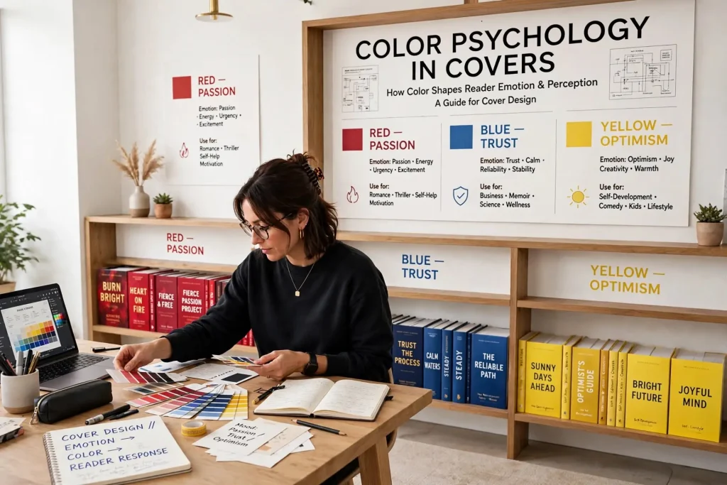
Most authors approach cover color decisions intuitively. They pick colors that look nice in a quick preview, that match the book’s mood as the author perceives it, or that suit personal aesthetic preferences. The decision matters more than authors typically realize. Color choices on book covers affect buyer emotions, communicate genre instantly, signal quality positioning, and influence purchase decisions in ways that have been studied across decades of cover design and consumer psychology. The cover color psychology that actually drives sales follows specific patterns by genre, audience, and positioning. Authors who pick colors based on these patterns tend to produce covers that convert browsers to buyers. Authors who pick colors casually often watch good books underperform because their covers send the wrong signals.
This post walks through how color actually affects buyer reactions, the specific color conventions that work for different genres, and how to make color decisions that support rather than undermine your book’s commercial chances.
How Color Affects Buyer Reactions
Color choices affect buyer reactions through several psychological mechanisms.
Emotional associations. Different colors trigger different emotional responses in viewers. Red activates urgency and intensity. Blue suggests calm and trust. Yellow evokes warmth and energy. These associations operate below conscious awareness but shape how viewers feel about what they see.
Cultural meanings. Colors carry cultural meanings that vary across societies. White signals purity in some cultures and mourning in others. Red signals luck in some cultures and danger in others. Book covers reaching international markets need to consider these variations.
Genre signaling. Book covers in specific genres use specific color patterns. Readers learn these patterns through exposure to many covers in their preferred genres. Matching or violating the patterns affects if readers recognize the genre instantly.
Quality positioning. Color treatments signal quality levels. Sophisticated color palettes with restrained use suggest premium positioning. Garish or random color choices suggest amateur production.
Attention attraction. Some color combinations stop the scroll on Amazon listings. Others fade into the background. Strong cover design uses color strategically to attract attention at the thumbnail size where most discovery happens.
These mechanisms work together. A cover’s color treatment simultaneously signals genre, suggests quality, evokes emotion, and either attracts or repels attention. Each function affects the others.
Color Conventions by Genre
Different genres have established color conventions that work consistently.
Romance
Romance covers typically use warm color palettes. Pinks, reds, purples, and warm pastels dominate. The colors signal emotional content and intimacy.
Subgenre variations matter. Contemporary romance often uses brighter, lighter palettes. Historical romance uses richer, more saturated colors. Paranormal romance often incorporates darker tones with magical or mysterious color accents.
Standout color treatments in romance often pair a main warm color with a contrasting accent. Soft pink with dramatic black typography. Warm purple with gold accents. The contrast creates visual interest while maintaining the warm overall tone.
Thriller & Suspense
Thriller covers typically use darker color palettes. Blacks, deep blues, blood reds, and muted gray tones dominate. The colors signal threat, urgency, and intensity.
High-contrast treatments work well. Stark black backgrounds with white or red typography. Dark imagery with single bright color accents. The contrast suggests drama and conflict.
Domestic thrillers sometimes use lighter palettes that subvert thriller expectations. The unexpected lightness signals psychological rather than violent threat.
Mystery
Mystery covers vary significantly by subgenre.
Cozy mysteries use lighter, friendlier color palettes. Warm yellows, soft blues, light greens. The colors signal that this is approachable rather than threatening fiction.
Noir mysteries use dark, moody color palettes. Deep blacks, atmospheric grays, sometimes a single dramatic color accent. The colors evoke classic noir aesthetics.
Police procedurals often use professional-feeling color palettes. Blues and grays predominate. The colors signal seriousness and authority.
Literary Fiction
Literary fiction covers typically use restrained color palettes. Muted tones, sophisticated combinations, often single-color treatments with subtle variations. The colors signal seriousness and artistic intent.
Bold single-color treatments work in literary fiction. A cover dominated by one specific color (forest green, deep red, midnight blue) can signal literary quality when the design execution is strong.
Avoiding over-saturated colors. Literary fiction rarely uses the bright saturated colors that work for genre fiction. The restraint signals different commercial positioning.
Science Fiction
Sci-fi covers vary by subgenre but tend toward specific color patterns.
Space opera often uses dark space backgrounds with bright accent colors. The contrast between deep dark and bright color suggests the scale of space settings.
Hard science fiction often uses cooler color palettes. Blues, grays, metallic tones. The colors signal technical sophistication.
Dystopian sci-fi often uses muted, washed-out palettes. The faded colors signal a degraded world.
Fantasy
Fantasy covers vary by subgenre.
Epic fantasy often uses rich, saturated color palettes. Deep purples, royal blues, gold accents. The colors signal grand scope and magical elements.
Urban fantasy often uses dark color palettes with neon or supernatural color accents. The combination signals the meeting of modern world and magical elements.
Sword and sorcery often uses earthier color palettes. Browns, deep reds, forest greens. The colors signal medieval-inspired settings.
Nonfiction
Nonfiction color conventions vary by topic and positioning.
Business books often use bold, confident color palettes. Strong reds, deep blues, contrasting whites. The colors signal authority and serious content.
Self-help often uses bright, aspirational color palettes. Bright yellows, oranges, optimistic blues. The colors signal possibility and personal growth.
Memoir often uses restrained color palettes similar to literary fiction. The colors signal personal narrative rather than commercial content.
Reference and technical books often use professional-feeling color palettes. Blues, grays, restrained accent colors. The colors signal practical content.
Specific Color Meanings
Beyond genre conventions, individual colors carry specific associations.
Red. Urgency, passion, intensity, danger, importance. Strong attention-grabbing color. Used carefully in covers because it can feel aggressive when overdone.
Orange. Energy, enthusiasm, warmth, creativity. Less aggressive than red but still high-impact. Works well for self-help and certain commercial fiction.
Yellow. Optimism, energy, attention. Highly visible at thumbnail sizes. Works for self-help and certain commercial fiction. Can feel cheap when overused.
Green. Growth, nature, money (in Western contexts), health. Works well for finance books, nature-related content, and certain fantasy.
Blue. Trust, calm, professionalism, depth. Most universally appealing color. Works across many genres. Can signal coldness when overused or wrongly toned.
Purple. Luxury, mystery, creativity, royalty. Works for fantasy, certain romance subgenres, and some nonfiction.
Black. Sophistication, mystery, formality, drama. Strong choice for thrillers and literary fiction. Can feel heavy when overused.
White. Cleanliness, simplicity, modernity. Works for minimalist designs across genres. Highly dependent on accompanying colors.
Brown. Earthiness, tradition, reliability. Works for nonfiction and certain genre fiction. Can feel dated if not handled carefully.
Gold. Premium quality, luxury, achievement. Often used as accent rather than dominant color. Works well for premium positioning.
Silver. Modernity, technology, sophistication. Often used as accent in sci-fi and contemporary nonfiction.
These associations operate as starting points. Specific cover designs can use any color effectively when the overall design supports the choice.
Color Combinations That Work
Beyond individual colors, specific combinations produce consistent results.
Complementary pairs. Colors opposite each other on the color wheel produce strong contrast. Red and green, blue and orange, purple and yellow. The combinations work when one color dominates and the other accents.
Analogous combinations. Colors adjacent on the color wheel produce harmonious palettes. Blue with purple. Yellow with orange. Red with pink. The combinations feel calm and unified.
Monochromatic. Single color in different shades and tints. Sophisticated and unified. Works well for literary fiction and premium positioning.
Triadic combinations. Three colors equally spaced on the color wheel. Bold but balanced. Used carefully in covers because the complexity can become overwhelming.
Black with single accent color. Strong contrast that draws attention. Common in thriller and high-impact nonfiction.
White background with bold elements. Clean and modern. Common in literary fiction and minimalist commercial fiction.
Practical Color Decision Process
Several practical steps support strong color decisions.
Study competitor covers. Look at the top-selling books in your specific subgenre. Note the color patterns. Authors trying to compete in established categories usually benefit from working within those color patterns.
Consider thumbnail visibility. Most discovery happens at small thumbnail sizes. Test how your color choices look at 100×150 pixel sizes. Colors that look strong at full size sometimes fade at thumbnail.
Consider cultural reach. If selling internationally, consider how colors translate across cultures. Colors with negative associations in major markets should be avoided or used carefully.
Match color to content. The colors should match the actual content of the book. Romance covers with dark threatening colors confuse buyers. Thriller covers with romantic pastels confuse buyers. The matching matters.
Test alternatives. Cover designers typically present multiple color variations. Genuinely consider alternatives rather than picking the first option that looks acceptable.
Get feedback from target readers. Show options to readers in your target audience before finalizing. Their reactions reveal what your own preferences might miss.
Common Color Choice Mistakes
Several patterns regularly produce covers with weak color decisions.
Personal preference over market signals. Authors who pick colors based on their own taste rather than market conventions often produce covers that send wrong signals.
Wrong colors for genre. Romance with thriller colors. Literary fiction with bright commercial colors. Mismatched signals confuse buyers.
Too many colors. Covers using five or more dominant colors usually feel cluttered and unfocused. Restricted palettes produce stronger covers.
Insufficient contrast. Covers where the title disappears against the background fail at thumbnail sizes. Strong title contrast matters.
Default color palettes. Software defaults rarely produce strong color choices. Custom color decisions almost always outperform defaults.
Ignoring cultural meanings. Colors with strong cultural associations sometimes get used without considering those associations. Research matters for international distribution.
Trend chasing without strategy. Following current color trends without considering if they fit your specific book. Trends pass while your book continues selling.
Color that fights the cover image. Color choices that don’t support or that actively conflict with the main cover imagery undermine the design.
Color as a Quiet Selling Tool
The color decisions on your book cover do significant work below conscious awareness for browsers and buyers. The colors signal genre, suggest quality, evoke emotion, and attract attention. The cumulative effect across thousands of cover impressions affects how many readers click through to your listing and how many of those clicks convert to sales.
Authors who treat color choices as serious design decisions rather than aesthetic preferences tend to produce covers that compete effectively in their categories. Authors who pick colors casually often watch otherwise strong books underperform because their covers send signals that don’t match what their target readers want. The investment of time to learn genre color conventions and apply them thoughtfully pays back across every reader who sees the cover. Color is one of the quiet tools that distinguishes professional cover design from amateur cover design, and the difference shows in sales numbers even when individual readers couldn’t articulate why one cover appeals more than another.


