
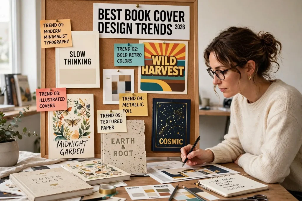
Most authors approach cover trends with one of two extreme attitudes. They either chase every trend that appears, producing covers that look exactly like everyone else’s covers, or they ignore trends entirely, producing covers that look dated five years before they actually are. The book cover trends that drive commercial results in 2026 follow specific patterns by genre. Knowing the current patterns helps authors produce covers that compete effectively in their categories while still maintaining distinctive elements that distinguish their books from look-alike competitors.
This post walks through specific cover trends visible in 2026 by genre, what’s gaining ground, what’s losing ground, and how to balance trend awareness with timeless design principles.
Romance Cover Trends
Romance covers have shifted significantly in recent years and continue evolving.
Illustrated covers dominate. Photographic romance covers have largely given way to illustrated treatment. Stylized illustrations of couples, characters, or scenes work across most romance subgenres in 2026.
Cartoon-inspired character illustrations. Specifically the modern illustrated style with simplified character forms in bold colors. The style works particularly well for contemporary romance and romcom.
Bright accent colors against neutral backgrounds. Modern romance covers often use a primarily neutral or pastel background with bold accent colors for titles and key visual elements.
Hand-drawn typography for titles. Custom hand-drawn or hand-drawn-style typography increasingly appears on romance titles, replacing the more standard serif and script typefaces.
Animal motifs in cozy romance. Cats, dogs, and other animals appearing as cover elements in cozy romance subgenres.
Holiday-themed visual elements. Christmas romance, fall romance, beach romance all use specific seasonal visual cues. The seasonal markers signal subgenre quickly.
What’s fading in romance. Traditional shirtless-man photo covers (the “fabio” look) appear less commonly in mainstream commercial romance. Still common in some specific subgenres but not the dominant style.
Thriller & Suspense Trends
Thriller covers continue using darker color palettes but with specific contemporary updates.
Single objects on dark backgrounds. The minimalist approach with one striking object (a key, a flower, a piece of jewelry, a small figure) against dark backgrounds continues working strongly.
Big bold typography. Title treatment using massive type that takes substantial cover real estate. The title becomes the dominant visual element rather than imagery.
Red, white, and black combinations. The color palette of red as accent against black and white backgrounds remains effective for thriller positioning.
Photographic imagery with significant manipulation. Photos modified to create unsettling or unusual visual effects. Reality tinged with strangeness.
Domestic thriller specifics. Houses, suburban settings, family imagery handled in unsettling ways. The visual approach signals psychological domestic thriller content.
Subgenre-specific evolution. Different thriller subgenres (psychological, crime, mystery thriller, etc.) have specific visual markers that distinguish them.
What’s fading in thriller. Overly literal weapon imagery (guns, knives prominently displayed) appears less commonly in current mainstream thriller covers. Suggestion replaces explicit threat imagery.
Fantasy Cover Trends
Fantasy covers vary dramatically by subgenre with several current trends.
Detailed illustrated covers for epic fantasy. Full painted-style illustrations showing characters, settings, or important scenes. The traditional fantasy cover approach updated with current illustration techniques.
Symbolic objects for fantasy romance. Magic items, weapons, runes treated as primary cover elements. The approach works particularly well for the booming fantasy romance subgenre.
Hand-drawn or watercolor-style illustration. Different from photorealistic painted style. Loose, expressive illustration approach.
Special edition embellishments. Hardcover special editions with foil, sprayed edges, illustrated endpapers, and other premium production elements. The booktok-driven market rewards collectible production values.
Bold typography integration. Title typography that’s part of the illustration rather than separate text overlay. The integration creates visual interest.
Map elements as design components. Maps appearing as cover backgrounds, endpapers, or design motifs. Connects to the genre’s tradition of cartographic worldbuilding.
What’s fading in fantasy. Generic CGI-style imagery of dragons, castles, or other fantasy cliches without distinctive treatment. The genre conventions still work but require specific execution rather than generic application.
Literary Fiction Trends
Literary fiction covers continue using restrained design approaches with specific contemporary patterns.
Minimalist typography with strong single colors. The cover dominated by typography against a single strong color background. Bold but restrained.
Abstract or symbolic imagery. Non-literal imagery suggesting themes rather than depicting content. Often subtle.
Nature elements in symbolic ways. Plants, water, sky, or other natural elements used symbolically rather than as direct illustration.
Limited color palettes. Often two to three colors used purposefully across the cover. Restraint signals literary positioning.
Custom typography rather than standard fonts. Hand-drawn or custom-designed letterforms that distinguish the cover from commercial fiction.
Award sticker space. Strong literary fiction covers leave compositional space for the literary awards and recognitions that successful books accumulate.
What’s fading in literary fiction. Photographic covers of people walking away from the camera. The trend dominated for years but appears less commonly now.
Nonfiction Cover Trends
Nonfiction cover trends vary significantly by topic but show several current patterns.
Bold typography dominance. Many current nonfiction covers feature title typography as the primary visual element with limited or no imagery.
Strong color blocks. Solid color backgrounds with title text rather than involved imagery. The approach works for business books, self-help, and other commercial nonfiction.
Single iconic objects. A single object that stands for the book’s topic, treated graphically. Photographs styled to feel more graphic than photographic.
Yellow as accent color. Yellow used strategically for attention-grabbing accents. Visible at thumbnail sizes.
Subtitle treatment as design element. Subtitles handled as significant design components rather than afterthoughts. Often longer subtitles get treated visually as part of the design system.
Memoir specifics. Memoir covers often use literary fiction conventions adapted to autobiographical content. Restrained, sophisticated, suggesting personal narrative.
What’s fading in nonfiction. Photographs of authors on commercial nonfiction covers (versus memoirs, where they remain common). Bold author photo approaches have largely been replaced by typography-dominant designs.
Young Adult Trends
YA cover trends continue evolving rapidly with several current patterns.
Illustrated covers across genres. YA fantasy, contemporary, romance, and thriller all show significant adoption of illustrated covers. Photographic covers appear less commonly than they did 5 years ago.
Color block typography. Bright colors with strong typography work for YA across genres.
Varied representation visible. Cover illustrations and photography prominently featuring varied character representation. The market has shifted significantly in this direction.
Hand-lettered titles. Custom hand-lettered typography appears commonly on current YA covers.
Sparkle and metallic effects. Foil, metallic inks, and similar production effects work for YA specifically. The audience responds to physical book features that adult markets respond to less.
Aesthetic-driven design. Specific aesthetic moods (cottage-core, dark academia, etc.) influence cover treatment beyond pure genre conventions.
What’s fading in YA. Photographic covers of single teenage characters looking moodily at the camera. The trend dominated YA for years but has been largely replaced by illustrated approaches.
Genre-Crossing Trends
Some trends appear across multiple genres in 2026.
Larger typography overall. Across most genres, title typography has grown larger relative to imagery. Thumbnail readability drives this trend.
Spot UV and special finishes. Print-on-demand has expanded to support spot UV, embossing, and other special finishes that were previously only economical for traditional print runs.
Hardcover special editions. The booktok-driven market has expanded demand for premium hardcover editions with foil, sprayed edges, and illustrated endpapers across genres.
Series visual systems. More authors using deliberate series visual systems where individual covers vary while series identity stays consistent.
Cover reveal marketing. Cover reveals as significant marketing events. The cover becomes promotional content beyond just packaging.
Balancing Trends With Timeless Principles
Following every trend produces look-alike covers that disappear into the genre. Ignoring trends produces dated covers that look out of place. The balance involves several specific approaches.
Apply genre conventions strongly. Get the genre signaling right above everything else. Trends within genre conventions matter. Trends that violate genre conventions damage commercial reception.
Distinguish through small choices. Strong covers fit genre conventions while still having distinctive elements. Find the specific small choices that differentiate without violating conventions.
Avoid the most temporary trends. Some trends last decades. Others fade in two years. Pick trends with staying power rather than ones that will date the book quickly.
Update older covers strategically. Books that hit major trend transitions sometimes benefit from cover updates that align with current conventions. Major changes done thoughtfully can extend a book’s commercial life.
Maintain catalog coherence. Each new book can use current trends while still feeling like it belongs to the same author’s catalog as earlier books. The author brand persists across trend cycles.
Watch competitor adoption rates. Trends that competitors are adopting heavily may be at peak saturation. Trends still emerging may offer more competitive openings.
Trends Within a Stable Visual Identity
Cover design trends matter, but they matter within the larger context of building a stable author visual identity that readers recognize across years and books. Authors who chase every trend tend to produce catalogs that look fragmented. Authors who ignore trends entirely tend to produce catalogs that look dated. The authors who build sustainable visual brands stay aware of current trends while applying them within their established visual identities rather than letting trends dictate every design decision.
The cover that succeeds combines genre awareness, current trend consciousness, and your specific author brand. Each element supports the others when handled thoughtfully. The genre conventions ensure readers recognize what the book is. The current trends ensure the cover doesn’t look dated. The author brand ensures recognition across your catalog. Authors who execute all three dimensions well tend to produce covers that work both commercially and brand-strategically. Authors who optimize for any one dimension at the expense of others usually find that the trade-off costs more than the focus gained. Cover design isn’t an isolated decision per book. It’s part of an ongoing visual conversation with your readers that spans years and books and trend cycles.


