
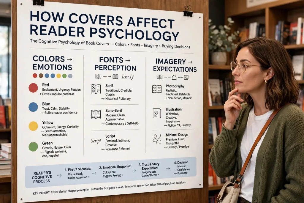
Most readers think they evaluate books rationally. They examine covers, read descriptions, check reviews, and decide based on what they find. The actual decision process operates significantly below conscious awareness. Covers trigger emotional responses, perception patterns, and decision biases before readers consciously evaluate anything. The reader psychology covers exploit isn’t manipulation but rather honest application of how human visual perception and decision-making actually work. Authors who understand these mechanics can produce covers that work with reader psychology rather than against it.
This post walks through the specific psychological mechanisms that affect how readers respond to covers, the visual elements that trigger specific responses, and how to design covers that work with rather than against the way readers actually decide.
How Readers Actually Decide
Reading decisions happen through a specific sequence that affects every other psychological mechanism.
The thumbnail moment. Most book discovery happens at thumbnail size in search results, category pages, or recommendation lists. The cover gets less than a second of attention. Most browsing decisions happen at this size.
The full-size evaluation. If the thumbnail captures interest, readers click through to see the cover at full size. The fuller examination triggers more sophisticated psychological responses.
The description engagement. After cover evaluation, readers may engage with the description. The cover has already set expectations that the description either confirms or violates.
The review checking. Some readers verify their cover-driven impressions through review checking. The reviews can confirm or override what the cover suggested.
The purchase decision. The actual buying decision combines all the inputs but heavily weights the initial cover impression.
Each stage filters readers. The cover that fails at thumbnail level never gets the deeper engagement. The cover that succeeds at thumbnail can survive minor weaknesses in later stages.
Attention Capture Mechanics
The first psychological challenge is getting readers to notice the cover among many competing options.
Visual contrast effects. Covers that stand out visually from surrounding covers in search results capture attention. The contrast can come from color, composition, or style. Looking different from neighboring covers matters.
Pattern interruption. Eyes track visual patterns and notice interruptions. A cover that breaks the pattern of surrounding covers gets attention. This is why genre-conventional covers sometimes need distinctive elements to stand out within genre.
The focal point. Strong covers have clear focal points that direct attention immediately. Weak covers leave eyes scanning for what to focus on. The clarity of focal point affects if covers get notice in the brief moment of thumbnail viewing.
Movement implied by composition. Eyes follow implied movement in compositions. Covers with directional elements that lead the eye work differently than static centered compositions.
Recognition triggers. Faces, hands, eyes, and other recognizable human elements capture attention faster than abstract imagery. The biological imperative to notice other humans operates in cover viewing too.
Color saturation effects. Highly saturated colors attract attention faster than muted ones at first glance, though saturation can be overused.
Size perception manipulation. Some compositional choices make covers feel larger or more substantial than their actual size. The perceived size affects attention.
Emotional Triggering Through Design
Beyond attention, covers trigger specific emotional responses that affect purchase decisions.
Mood transmission through imagery. Photographic or illustrated imagery transmits mood directly. Threatening imagery makes readers feel threatened. Romantic imagery triggers romantic feelings. The transmission happens below conscious processing.
Color mood effects. Different colors trigger different emotional baselines. The color choices establish the emotional starting point for everything else.
Symbolic element triggers. Symbols carry cultural meanings. Crosses, weapons, flowers, animals all carry specific associations. Strong covers use symbols intentionally rather than randomly.
Compositional tension or rest. Compositions can feel tense or restful through specific design choices. Tense compositions suit thrillers. Restful compositions suit literary fiction or romance.
Implied narrative. Some covers suggest specific story moments. The implied narrative triggers reader interest in the larger story the moment is part of.
Aspirational signaling. Some covers signal the experience or transformation readers can have through reading the book. Self-help covers particularly use aspirational signaling.
Identity triggering. Some covers signal “this is for people like you.” The identity match drives interest from readers who recognize themselves in the cover’s signaling.
The emotional triggering works in seconds. Readers feel before they think. The feeling shapes whatever conscious evaluation follows.
Perceived Value Signaling
Beyond emotional triggers, covers signal perceived value that affects price acceptance and purchase decisions.
Production quality signals. Sophisticated cover design signals professional production overall. Readers infer that books with strong covers probably have strong content.
Premium aesthetic signals. Specific design choices signal premium positioning. Restraint, sophisticated color palettes, custom typography all suggest higher value.
Discount aesthetic signals. Other design choices signal budget positioning. Garish colors, multiple fonts, stock imagery all suggest lower value.
Category positioning signals. Covers signal where the book fits within its category. Premium positioning, mainstream positioning, niche positioning, budget positioning all show through design choices.
Imprint suggestion effects. Some covers look like they come from major publishers. Others look obviously self-published. The imprint suggestion affects perceived credibility.
Awards and bestseller signals. Bestseller badges, award stickers, and similar visual elements signal credibility from third-party validation.
These value signals affect price perception. Readers expect to pay more for books that look more valuable. The same book at the same price reads as overpriced with weak cover or fair-priced with strong cover.
Gestalt Principles in Cover Design
Several gestalt psychology principles affect how readers perceive cover compositions.
Proximity grouping. Elements close together get perceived as related. Strong covers group related elements (title and subtitle, author name and tagline) through proximity.
Similarity grouping. Elements with similar visual treatment get perceived as related. Same color, same typography, same scale all create grouping.
Closure effects. Eyes complete partial shapes. Strong covers can use partial visual elements that the eye completes, creating engagement.
Figure-ground separation. The clear distinction between foreground subject and background. Strong covers have clear figure-ground relationships. Weak covers leave the figure indistinct from the ground.
Continuation effects. Eyes follow continuous lines or curves. Compositions with implied continuation guide attention through the cover.
Symmetry preference. Eyes generally find symmetric compositions more comfortable than asymmetric ones, though intentional asymmetry can create dynamic interest.
Common fate. Elements moving or pointing in the same direction get perceived as related. Visual elements oriented the same way create grouping.
These principles operate automatically. Readers don’t consciously apply gestalt rules but their visual perception follows them. Designers who understand the principles can use them intentionally.
Social Proof Through Design
Some cover psychology operates through implied social proof.
Bestseller badges. The orange “#1 Best Seller” badge or similar markers indicate social validation. Readers respond to the implied “many other people chose this.”
Award stickers. Awards from credible organizations carry weight. Pulitzer, National Book Award, Hugo, Nebula, Edgar all signal quality.
Praise blurbs. Quoted praise from notable sources signals quality. Even one strong blurb affects perception.
Series indicators. Books prominently identified as parts of series carry implied social proof through the series’s existence. Readers assume series get continued because earlier books succeeded.
Edition information. “Now a major motion picture” or similar indicators signal validation through other media adoption.
Publisher signals. Imprints with strong reputations carry credibility. Major publisher imprints signal vetting that self-published books lack.
Reader count signals. Some covers reference reader counts (“Over one million copies sold”) to signal popularity. The implied social proof can affect purchase decisions.
These social proof elements work because readers reasonably infer that things many other people chose probably have value worth investigating.
Cognitive Biases That Affect Cover Decisions
Several cognitive biases affect how readers respond to covers.
Availability heuristic. Readers judge book quality partly by similarity to other books they’ve enjoyed. Covers that look like previous favorites get tested by expectation rather than purely on their own merits.
Halo effect. Strong cover design creates positive halo that affects perception of other elements. Books with strong covers get assumed to have strong content. The assumption may not be correct but it affects purchase decisions.
Confirmation bias. Readers who form initial cover impressions tend to look for confirming evidence. Cover-driven first impressions shape how subsequent reading proceeds.
Anchoring effects. The first elements readers notice on a cover anchor perception of everything else. Strong title placement and treatment anchors strongly.
Loss aversion. Readers fear wasting time and money on bad books. Covers that signal low quality trigger loss aversion that prevents purchase even when the book might be excellent.
Status quo bias. Readers tend to stick with familiar patterns. Genre-conventional covers benefit from this bias. Highly unconventional covers fight against it.
Mere exposure effect. Repeated exposure to similar visual styles makes those styles feel comfortable. The effect is why genre conventions matter and why following them produces commercial advantages.
Authors who understand these biases can design covers that work with rather than against them.
Genre-Specific Psychological Patterns
Different genres trigger different psychological patterns in their readers.
Romance reader psychology. Romance readers respond to emotional signaling, escapism cues, and aspirational fantasy. Covers should trigger anticipation of emotional experience.
Thriller reader psychology. Thriller readers respond to tension, threat, and intellectual puzzle signals. Covers should create urgency and intellectual engagement.
Literary fiction reader psychology. Literary readers respond to aesthetic sophistication and intellectual signaling. Covers should suggest serious artistic content.
Self-help reader psychology. Self-help readers respond to aspiration and transformation signaling. Covers should suggest the improvement readers want.
Business book reader psychology. Business readers respond to authority and competence signaling. Covers should signal expert content.
Fantasy reader psychology. Fantasy readers respond to world-building signals and escapist appeal. Covers should suggest the immersive worlds the books contain.
YA reader psychology. YA readers respond to identity signals and aesthetic appeal. Covers should signal the reader experience and identification.
Each genre’s readers bring specific psychological patterns that successful covers leverage.
Designing for the Reader’s Subconscious
Cover psychology isn’t manipulation. It’s recognition that humans process visual information through specific mechanisms that operate largely below conscious awareness. Authors and designers who design with these mechanisms in mind produce covers that work with how readers actually decide rather than fighting against natural perception patterns.
The work involves several practical applications. Knowing attention capture mechanics. Triggering appropriate emotional responses. Signaling proper perceived value. Applying gestalt principles to composition. Leveraging social proof elements. Working with rather than against cognitive biases. Matching genre psychological patterns. Each element matters individually and they compound when handled well.
Authors who treat cover psychology as serious design discipline rather than artistic guesswork tend to produce covers that perform commercially. Authors who design based purely on personal aesthetic preferences often produce covers that may please themselves but don’t connect with the psychological patterns their target readers actually operate through. The investment in psychological awareness pays back across every reader who encounters the cover for as long as the book stays in catalog. The reader’s subconscious does most of the work in cover-driven purchase decisions, and designing for that subconscious matters more than most authors initially recognize before they study how cover psychology actually operates.


