
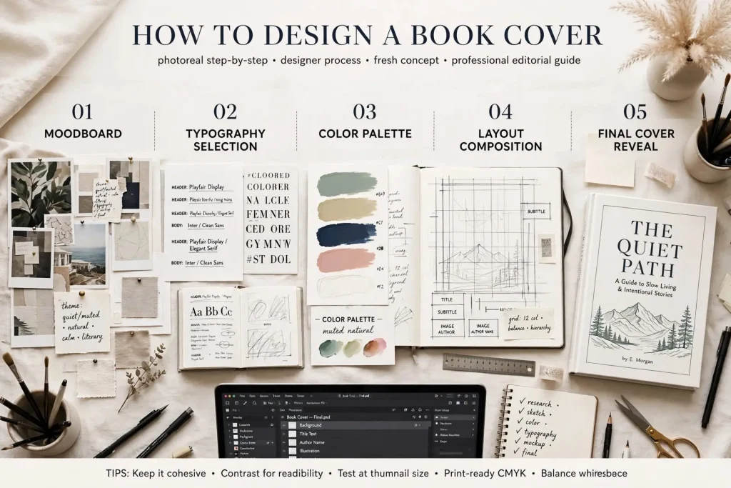
Most authors approach cover design with one of two extreme positions. They either default immediately to hiring designers without considering DIY possibilities, or they attempt DIY without the skills or tools required to produce competitive results. The reality of how to design book cover work sits between these extremes. Some authors can produce professional-quality covers themselves with proper investment in tools and learning. Other authors should hire professionals. The decision depends on specific factors that authors should evaluate before committing either direction.
This post walks through the actual cover design process, the tools and skills required for DIY work, and how to make informed decisions about DIY versus professional design.
The Cover Design Process Overview
Cover design involves several specific steps that apply if you DIY or hire out.
Research phase. Study competitor covers in your specific subgenre. Identify visual conventions that successful books follow. Note what makes certain covers stand out within those conventions.
Concept development. Generate concepts for your cover that fit genre conventions while having distinctive elements. Most successful covers start with concept development rather than jumping straight to execution.
Design execution. Actually creating the cover. Software, image selection or creation, typography work, composition decisions, color choices.
Testing phase. Evaluating the cover at thumbnail sizes, against competitor covers in mock listing contexts, and through reader feedback.
Iteration. Most strong covers go through multiple iterations before finalization. The first version rarely is the best version.
Production preparation. Setting up files for print and digital production. Different specifications for different platforms.
Each step matters. Skipping steps produces weaker covers than working through the full process produces.
Tools You Actually Need
DIY cover work requires specific tools.
Adobe Photoshop. Industry standard for raster image work. $20.99/month subscription. Strong choice for photographic covers or covers with significant image manipulation.
Adobe Illustrator. Industry standard for vector work. $20.99/month subscription. Best for typography-heavy or illustrated covers.
Adobe Creative Cloud. Bundle of Adobe tools. $59.99/month. Strong choice if you’ll use multiple Adobe products.
Affinity Photo and Affinity Designer. Lower-cost alternatives to Photoshop and Illustrator. One-time purchase around $69-$99 each.
GIMP. Free open-source alternative to Photoshop. Capable but with steeper learning curve.
Canva Pro. Web-based design tool with templates and assets. $12.99/month. Suitable for some cover work but limited for serious design.
Vectornator. Free vector design tool. Capable but less mature than Adobe Illustrator.
Stock image subscriptions. Adobe Stock, Shutterstock, Getty Images, or others. $20-$200/month depending on tier.
Font licensing. Many fonts are free for commercial use. Premium fonts may cost $20-$200 for commercial licensing. MyFonts and Fontspring are common sources.
The tool investment for serious DIY cover work runs $50 to $100/month plus occasional larger purchases. The investment makes sense if you’ll produce multiple covers across years.
Studying Genre Conventions First
Before designing, you need to know what works in your specific subgenre.
Browse Amazon bestseller lists. Look at the top 50 books in your subgenre. Note visual patterns.
Save reference covers. Build a folder of successful covers in your category. Reference repeatedly during your own design work.
Identify common elements. Color palettes that recur. Typography styles that appear. Imagery types that work. Composition approaches that succeed.
Note variations within conventions. Even within genre conventions, successful covers have distinctive elements. Study what variations work versus what variations fail.
Look at multiple subgenres. If your book sits between subgenres, study covers from all relevant subgenres. The hybrid approach may inform your specific cover.
Watch for evolution over time. Compare current bestsellers to bestsellers from 5 years ago. Note how conventions have evolved.
The research phase should take several hours minimum before any design work begins. Authors who skip research often produce covers that don’t fit genre conventions even when individual elements look fine.
Typography Selection & Treatment
Typography choices significantly affect cover quality.
Title font selection. Different genres favor different font categories. Romance often uses scripts or modern serifs. Thrillers use bold sans-serifs or distressed types. Literary fiction uses sophisticated serif treatments.
Subtitle font relationship. Subtitle fonts should relate to title fonts. Same family used in different weights, or carefully chosen complementary families. Random font pairing damages composition.
Author name treatment. Author names should appear professionally without competing with title for attention. Position, size, and font choice all matter.
Hierarchy through typography. Strong covers establish clear visual hierarchy. Title prominent. Author name secondary. Other text supporting.
Letter spacing adjustments. Default letter spacing rarely produces optimal results. Manual adjustment of letter spacing distinguishes professional typography.
Title sizing for thumbnail readability. Titles must be readable at thumbnail sizes (around 100×150 pixels in Amazon search results). Test thumbnail readability before finalizing.
Color treatment of typography. Type color affects readability and visual impact. Strong contrast with backgrounds. Color choices that fit overall palette.
Typography craft develops with practice. DIY designers who study typography seriously can produce competitive results. Those who use default settings without learning typography craft usually can’t.
Image Selection or Creation
Cover imagery comes from several sources.
Stock photography. Adobe Stock, Shutterstock, iStock, Getty, and others. Hundreds of millions of images available. Strong covers often combine multiple stock elements rather than using single images directly.
Original photography. Custom photographs taken specifically for the cover. Higher cost but produces distinctive imagery.
Illustrated covers. Custom illustrations, AI-generated imagery (where legally appropriate), or licensed illustration. Increasingly popular across genres.
Public domain imagery. Older artworks and photographs that have entered public domain. Free to use but limited selection.
Typography-only covers. Some genres support covers without imagery, using typography as the dominant visual element. Less imagery to acquire but more typography craft required.
Image manipulation skills. Most stock-based covers require significant manipulation. Color adjustments, removal of unwanted elements, combination of multiple sources. Skills required.
License verification. All cover imagery must be properly licensed for commercial use. Skipping license verification creates legal exposure.
Authors with strong image work can produce striking covers. Authors without image manipulation skills usually need to compensate with other strengths or hire help.
Composition & Layout Principles
Composition affects how readers respond to covers.
Focal point clarity. Strong covers have clear focal points that direct attention immediately. Multiple competing focal points fragment attention.
Visual hierarchy through scale. Important elements (title) get larger treatment than less important ones. The hierarchy guides reader attention.
Negative space utilization. Empty space serves composition rather than being avoided. Strong covers use white space intentionally.
Asymmetry versus symmetry. Both can work. Symmetric compositions feel stable. Asymmetric compositions feel dynamic. Choose intentionally rather than defaulting.
Visual flow. Eyes follow specific paths through compositions. Strong covers guide the eye through purposefully.
Edge consideration. How elements relate to cover edges. Pushing too close to edges feels cramped. Too much edge space wastes design opportunity.
Genre-appropriate composition. Different genres favor different compositional approaches. Match composition to genre expectations.
Composition rules can be broken intentionally but should be understood before breaking them.
Color Decisions
Color choices significantly affect cover effectiveness.
Genre-appropriate palettes. Different genres favor different color palettes. Match to genre conventions while having room for distinctive choices.
Color combinations. Most strong covers use 2 to 4 colors purposefully. More colors usually fragment the composition.
Contrast considerations. Text needs sufficient contrast against backgrounds. Test contrast at various viewing sizes.
Mood through color. Colors trigger emotional responses. Match color mood to book content.
Cultural color awareness. Colors carry different meanings in different cultures. International distribution requires awareness.
Testing color rendering. Different devices and platforms render colors differently. Test cover appearance across multiple contexts.
CMYK versus RGB. Print files need CMYK color space. Digital files use RGB. Color choices may shift between color spaces.
Testing Your Cover
Before finalizing, several tests improve cover decisions.
Thumbnail size testing. Reduce the cover to about 100×150 pixels. Does it still work? Most discovery happens at this size.
Mock listing testing. Place your cover in mock Amazon search results among competitor covers. Does yours stand out appropriately?
Reader feedback. Show alternatives to target readers. Ask which they prefer and why. Their reactions reveal what you might miss.
A/B testing through ads. Run small ad campaigns with different cover variations. Real-world performance data trumps opinions.
Cross-device testing. View the cover on phone, tablet, and computer. Different devices may reveal issues.
Print proof. Order a physical proof copy. The cover that looks fine on screen may have print issues.
Color verification. Verify color reproduction matches intent. Use calibrated displays for color-sensitive work.
Testing catches issues that designer review alone misses. Strong covers usually go through testing before finalization.
When DIY Works & When to Hire
Specific factors determine if DIY makes sense for your specific situation.
DIY works when. You have genuine design skills and software knowledge. You have time to invest in iterative design work. Your book is in genres where you can study conventions effectively. You’ll produce multiple books that justify tool investment. You can evaluate your own work objectively.
Hire professionals when. You lack design skills or software knowledge. Your time is more valuable spent on writing or marketing. Your book targets genres requiring specific design expertise. You’ll produce few books that don’t justify tool investment. You can’t objectively evaluate your own design work.
The middle path. Some authors learn enough design skill to handle basic covers while hiring professionals for hardcover special editions or particularly important launches. The hybrid approach can work.
The cost comparison. Professional covers cost $300 to $2,500 typically. DIY tools cost $50-$100/month plus learning time. The cost calculation depends on how many covers you’ll produce.
The quality comparison. Professional designers usually produce stronger covers than DIY first attempts. The quality gap narrows with DIY experience but rarely fully closes for most authors.
When to Design Yourself & When to Hire Out
The DIY versus hire decision deserves serious evaluation rather than default choice in either direction. Authors who attempt DIY without honest assessment of their skills often produce covers that hurt their books commercially. Authors who hire professionals without considering DIY may miss developmental opportunities and spend money they didn’t need to spend.
The right answer depends on your specific situation. Authors with genuine design interest who plan long careers may benefit from learning cover design as professional skill. The investment of time and tools pays back across many books over years. Authors without design interest or skill should hire professionals and focus their energy on writing and business work where they have advantage. Authors in middle ground might experiment with DIY for less commercial books while hiring professionals for important releases. The honest evaluation of your specific skills, time availability, business strategy, and career horizon should drive the decision rather than romanticized notions about author independence or assumed limitations about design capability. Both paths can produce strong covers. Both paths can produce weak covers. The choice should reflect realistic assessment of which path best fits your specific situation.


