
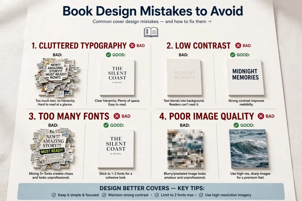
Most discussions of book design mistakes focus on covers because covers drive initial purchase decisions. The reality is that book design mistakes happen across the entire book, and the interior design mistakes and formatting errors damage reader experience and credibility in ways that affect long-term sales even when covers are strong. The book design mistakes that hurt sales include both the obvious cover problems and the less-visible interior issues that erode reader trust during actual reading. Authors who address only cover design while neglecting interior design and formatting often produce books that look good in thumbnail but disappoint readers who actually open them.
This post walks through the design mistakes that happen across the entire book beyond just the cover, why interior and formatting errors damage sales even when readers can’t articulate why, and how to fix the most common problems.
Where Design Mistakes Actually Happen
Design mistakes occur across multiple categories of the book.
Cover design mistakes. The most visible category. Affects initial purchase decisions. Covered extensively in dedicated discussions of cover-specific issues.
Interior typography mistakes. Font choices, sizing, spacing, and treatment within the book. Affects reader experience during actual reading.
Chapter and section design errors. How the book’s structure gets presented visually. Affects perceived production quality and reading flow.
Layout mistakes. Margins, line spacing, page composition, and overall visual treatment. Affects reading comfort and perceived quality.
Front and back matter mistakes. Title pages, copyright pages, about-the-author pages. Affects first and last impressions of the book experience.
File format and conversion errors. Technical errors that produce display problems on specific devices or platforms.
Print production errors. Issues that occur during print conversion that affect physical books.
Cross-format consistency issues. Differences between print, ebook, and audiobook editions that fragment the brand.
Each category produces its own specific damage to reader experience and ongoing sales. Authors who address only the most visible category miss issues that affect long-term reception.
Interior Typography Mistakes
Interior typography affects every page of reading. Mistakes here damage reading experience continuously.
Wrong fonts for the genre. Different genres favor different interior typography conventions. Literary fiction tends toward serif fonts. Tech-focused nonfiction may use modern sans-serif. Romance often uses specific established typography. Wrong fonts signal mismatch.
Inappropriate font sizes. Body text too small produces eye strain. Body text too large feels childish or wastes pages. Standard body text typically runs 10-12 points for print and proportional for ebook reflow.
Bad line spacing. Lines too close together feel cramped. Lines too far apart feel disconnected. Standard line spacing typically runs 1.2-1.5 times font size.
Wrong line lengths. Lines too long (more than 70-80 characters per line) tire readers. Lines too short feel choppy. Adjust through margin and font size choices.
Default software fonts. Microsoft Word and similar applications come with specific fonts that signal amateur production. Times New Roman, Calibri, and similar defaults rarely produce professional results in books.
Inconsistent font usage. Some chapters in one font, others in different fonts. The inconsistency signals careless production.
Bad widow and orphan control. Single lines stranded at tops or bottoms of pages. The composition problems affect reading flow.
Improper hyphenation. Either no hyphenation (producing awkward gaps in justified text) or excessive hyphenation (with multiple hyphens in consecutive lines). Both damage reading experience.
Authors using Vellum, Atticus, or working with professional formatters usually avoid these mistakes. Authors using Word for direct ebook conversion often produce books with multiple interior typography issues.
Chapter & Section Design Errors
How books mark structural divisions affects reading experience and perceived production quality.
Inconsistent chapter openings. Some chapters get elaborate treatment, others get plain treatment. The variation looks like mistakes.
Wrong chapter title treatment. Chapter titles too small, too large, or treated inconsistently with the book’s overall design.
Bad first paragraph handling. The convention of no first-line indentation on first paragraphs of chapters often gets violated, or applied inconsistently.
Inconsistent scene breaks. Different visual treatments for scene breaks in different chapters. The variation looks unintentional.
Missing scene break markers. Books that use only blank lines for scene breaks often leave readers unsure if breaks occurred.
Cramped chapter openings. Chapter titles too close to body text. The crowding makes openings feel rushed rather than significant.
Wrong recto convention. Books that should start chapters on recto pages but mix the convention inconsistently.
Page break errors. Chapters ending awkwardly with one or two lines on otherwise empty pages, or starting immediately after the previous chapter without proper page break.
Drop cap mistakes. Drop caps that don’t align with body text properly. Drop caps that use wrong fonts. Drop caps that vary across chapters.
These chapter design errors compound across hundreds of pages. The cumulative effect significantly affects reader experience.
White Space & Margin Mistakes
How books handle white space and margins affects perceived quality and reading comfort.
Margins too narrow. Text pushed too close to page edges feels cramped. Standard margins typically run 0.5-0.75 inches minimum.
Margins too wide. Excessive margins waste pages and feel underused. Some context-specific reasons exist but require justification.
Inconsistent margins. Some pages with one margin setting, others with different margins. The variation suggests careless production.
Bad gutter handling. Print books need adequate gutter margins (inside margins) to prevent text disappearing into the binding. Page count affects required gutter width.
Crowded chapter openings. Insufficient space above chapter titles. The crowding makes chapter starts feel rushed.
Bad header and footer placement. Page headers too close to body text. Page numbers in awkward positions. The spacing affects reading flow.
White space around images. Insufficient space around images makes them feel cramped against text. Too much space creates awkward pages.
The white space decisions seem small but affect reading experience continuously across the book.
Page Layout Errors
Page composition affects reading experience and perceived quality.
Bad column treatment. Books with multiple columns of text need specific handling. Wrong column widths or insufficient column gaps damage readability.
Improper text justification. Justified text with bad word spacing creates visible “rivers” of white space running through paragraphs. Forced justification without proper hyphenation produces this commonly.
Wrong alignment choices. Left-aligned versus justified text. Each has appropriate uses. Wrong choice for the context damages reading.
Bad table treatment. Tables that don’t fit properly, that have inconsistent formatting, or that don’t reflow appropriately in ebook formats.
Image placement problems. Images that interrupt text awkwardly, that float in unclear ways, or that don’t relate clearly to surrounding text.
Footnote handling issues. Footnotes that don’t appear consistently. Mixed footnote and endnote treatment without clear logic. Footnotes that break reading flow excessively.
Sidebar placement issues. Books with sidebars need consistent sidebar treatment. Random sidebar placement creates layout problems.
Pull quote handling. When books use pull quotes, the treatment should be consistent and serve readability rather than disrupting it.
Front & Back Matter Mistakes
Front and back matter affects first and last impressions of the book experience.
Bad title page design. Title pages that look amateur signal weak production. Strong title pages match the book’s overall visual identity.
Wrong copyright page format. Copyright pages have established conventions. Missing information, wrong formatting, or non-standard treatment all signal amateur production.
Missing dedication or acknowledgments treatment. When included, these pages should be treated thoughtfully. Generic treatment misses opportunity to add personal connection.
Bad about-the-author pages. The author bio page is significant marketing real estate. Weak bio pages waste this opportunity.
Wrong also-by treatment. Listings of the author’s other books should be inviting and well-organized. Bad treatment misses cross-promotion opportunity.
Missing or weak reader engagement requests. The end of the book is where readers are most engaged. Strong books include thoughtful requests for reviews, email signups, or other reader engagement. Missing this opportunity loses significant value.
Bad next-book teasers. Books in series should preview the next book effectively. Weak previews lose read-through opportunity.
Inconsistent back matter across books. Different back matter approaches across an author’s catalog fragments the brand experience.
File Format & Conversion Errors
Technical errors in file production affect how books display on devices.
Bad ebook conversion. Converting Word documents directly to Kindle format often produces formatting errors. Professional ebook conversion tools or services prevent many issues.
Lost formatting in conversion. Bold, italics, headers, and other formatting can disappear or change unexpectedly during format conversion.
Image embedding problems. Images that don’t display properly across devices. Wrong image formats, sizes, or color profiles produce display issues.
Font embedding failures. Print PDFs with non-embedded fonts produce font substitution that changes the design. Ebook files with custom fonts that don’t display on all readers.
Table of contents errors. Auto-generated table of contents with broken links. Manual table of contents that doesn’t match actual content.
Hyperlink failures. Internal links that don’t work in ebook formats. External links that no longer point to valid pages.
Metadata problems. Wrong title, author, or other metadata embedded in files. Metadata problems affect search results and library organization.
Print file specifications. Wrong dimensions, wrong bleed, wrong color space all produce print problems.
These technical errors often go unnoticed by authors until readers report problems. Quality control before publication catches issues that proper testing reveals.
Cover-Interior Mismatch Issues
Beyond individual element issues, mismatch between cover and interior creates problems.
Style inconsistency. Cover design suggesting one mood while interior design suggests another. The mismatch confuses readers.
Quality level inconsistency. Strong cover with weak interior, or vice versa. The mismatch creates jarring transitions in the reading experience.
Genre signaling mismatch. Cover signaling one genre while interior treatment suggests another. The mismatch damages reader expectations.
Production quality inconsistency. Professional-looking cover with amateur-looking interior. The mismatch signals incomplete production attention.
Branding mismatch across formats. Print cover, ebook cover, and audiobook cover that don’t visually connect. The fragmentation damages brand recognition.
Strong publishers maintain coherence between cover and interior. The cover sets expectations that the interior should fulfill. Mismatches damage reader trust even when individual elements are strong.
Print Production Errors
Print-specific errors affect physical book quality.
Wrong bleed setup. Files without proper bleed produce white edges when trimming varies. Standard 0.125 inch bleed prevents this.
Wrong color space. Print files in RGB instead of CMYK produce color shifts. CMYK is the standard for professional printing.
Insufficient resolution. Print files at less than 300 DPI produce pixelated results. Always set images at 300 DPI at final size.
Bad PDF setup. Print PDFs missing essential elements (fonts embedded, transparency flattened, color profiles attached) produce print problems.
Spine width errors. Wrong spine width calculation produces spine text in wrong position. Calculate based on page count and paper choice.
Cover wraparound errors. Print covers that don’t properly handle front, spine, and back as integrated whole.
Paper choice mistakes. Wrong paper choice for the book type. Glossy versus matte. Cream versus white. The choices affect perceived quality.
Print proof skipping. Authors who don’t order print proofs miss errors that proper testing reveals.
Treating Design Errors as Learning Opportunities
The design mistakes covered in this post recur regularly across self-published books. Authors who become aware of the mistakes and systematically address them produce significantly stronger books than authors who never consider these issues. The work to address design mistakes isn’t extreme. Most authors can learn to identify the issues and either fix them themselves or work with professionals who fix them.
The honest assessment matters more than the technical knowledge. Authors who can look at their own books critically and recognize what’s working versus what isn’t tend to improve over time. Authors who feel defensive about their existing work and reject feedback about design issues often produce books that retain the same problems across their entire catalogs. The mistakes that damage books are usually fixable. The willingness to fix them depends on the author’s attitude toward design as serious professional work versus personal expression that shouldn’t be criticized. Authors who treat design errors as learning opportunities tend to develop into stronger book producers over years. Authors who treat design feedback as personal attacks often produce books that suffer the same design weaknesses across their entire publishing careers. The choice between these approaches typically determines significant differences in the quality and commercial reception of work produced across an author’s career.


