
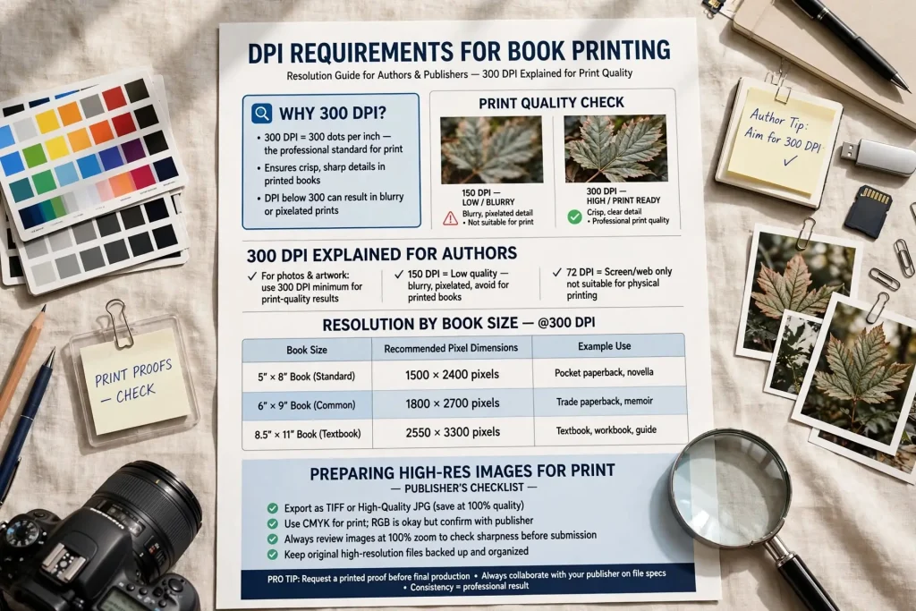
Most authors who handle their own book design or work with designers without printing experience discover DPI requirements only when something goes wrong. The book comes back from the printer with pixelated images. The cover looks crisp on screen but blurry on paper. The interior photos that looked sharp on the computer print with visible quality problems. The dpi book printing standards exist for specific technical reasons and following them produces books that look professional in physical form. Authors who learn the standards avoid the print quality problems that catch unprepared designers off guard.
This post walks through what DPI actually means for print, the specific requirements for different elements, and how to ensure your books meet professional quality standards in physical printing.
What DPI Actually Means for Print
DPI stands for dots per inch. The measurement describes how many ink dots get placed in each inch of printed output.
The basic concept. Higher DPI means more dots per inch which means finer detail and smoother appearance. Lower DPI means fewer dots which means coarser detail and possible visible pixelation.
The print versus screen distinction. Screens display at 72-150 DPI depending on device. Print requires significantly higher DPI to look smooth at viewing distance.
The standard print requirement. 300 DPI is the industry standard for professional book printing. This requirement applies to images, photos, and any raster graphic elements.
The vector exception. Vector graphics (created in Illustrator, for example) scale to any size without DPI limitations. Vector elements don’t have DPI in the same way raster images do.
The viewing distance factor. Books get viewed at close distance, typically 12-18 inches. The close viewing distance demands higher resolution than billboards or other distantly viewed printed materials.
The output quality factor. Higher DPI files don’t always mean dramatically better print. The benefit caps at the printer’s actual output capability and the eye’s resolution limit at viewing distance.
These principles explain why specific DPI standards exist and why following them matters for print quality.
Standard DPI Requirements for Book Printing
Several specific DPI standards apply to book printing.
300 DPI minimum for most print applications. The industry standard for professional book printing. Most printers reject files below this resolution.
300 DPI at final print size. The DPI requirement applies at the size the image will actually print. A photo at 300 DPI at 2 inches becomes 150 DPI when printed at 4 inches.
600 DPI for line art and high-detail graphics. Charts, diagrams, line drawings benefit from higher resolution. 600 DPI is common for these elements.
1200 DPI for some specialized applications. Very fine line detail or specific graphic elements may benefit from higher resolution. Rare in book printing but exists for specific uses.
72-150 DPI for ebook files. Digital books don’t need print resolution. Higher resolution wastes file size without benefit on screens.
The print-vs-digital decision. Files for print and digital use should be optimized for their specific use case. Same image at different resolutions for different outputs.
These standards form the baseline for professional book printing. Going below them produces visible quality problems. Going significantly above usually wastes file size without visible benefit.
Cover DPI Specifications
Cover files have specific DPI requirements that affect production.
The cover file requirement. 300 DPI at full print size. The full print size includes bleed area beyond the trim line.
The calculation example. A 6×9 inch book with 0.125 inch bleed needs cover file at 6.25 x 9.25 inches at 300 DPI. That’s 1875 x 2775 pixels minimum.
The wraparound cover calculation. Print covers include front, spine, and back wrapped around the binding. The total file dimensions can run 12+ inches wide. At 300 DPI, that’s 3600+ pixels wide.
The hardcover dust jacket consideration. Dust jackets have additional flap dimensions. The total file can be even larger.
The high resolution recommendation. Some authors create cover files at 600 DPI to provide quality margin. The increased file size may slow production workflows but provides quality assurance.
The image source consideration. The source images used in cover composition need to be high enough resolution to work at 300 DPI at print size. Source images smaller than print size produce pixelated results.
The print verification. Order a printed proof. Examine cover quality at typical viewing distance. Issues that look minor on screen may be visible on physical books.
Cover DPI affects how the first reader impression actually looks. Investing in proper cover resolution typically pays back through better physical book quality.
Interior Image DPI Requirements
Books with interior images have specific resolution requirements.
The 300 DPI baseline for interior photos. Same standard as covers applies.
The line art consideration. Diagrams, illustrations, and other line graphics benefit from 600+ DPI. The higher resolution preserves crisp line detail.
The chart and graph consideration. Data visualizations need high enough resolution to keep text and lines readable. 600 DPI often works well.
The decorative element consideration. Ornaments, chapter dividers, and other decorative elements work at standard 300 DPI typically.
The text-as-image avoidance. Whenever possible, text should be set as actual text rather than as image. Text-as-image creates resolution issues and prevents proper handling.
The book-specific factors. Children’s books with heavy illustration. Photography books. Cookbook with food photography. Each has specific resolution needs based on visual content importance.
The grayscale versus color consideration. Color images may need slightly different handling than grayscale. Color profiles and printing characteristics affect both.
Interior images shape reader experience throughout the book. Proper resolution affects how every page looks across hundreds of pages of reading.
DPI vs PPI Distinctions
The terms DPI and PPI get used interchangeably but have technical distinctions.
DPI definition. Dots per inch. Refers to printer output capability.
PPI definition. Pixels per inch. Refers to image resolution.
The practical interchangeability. In casual use, the terms get used to mean similar things. The distinction matters less than the underlying resolution adequacy for print.
The image software treatment. Photoshop and similar tools use PPI in their settings. The PPI value typically affects how images print.
The printer treatment. Printers have their own DPI capabilities that may differ from image PPI. Most modern printers handle 300 PPI source images well.
The verification approach. Don’t get caught in terminology debates. Focus on if images will look good at print size. The actual outcome matters more than terminology.
For practical purposes, ensuring 300 PPI/DPI at print size produces good print outcomes regardless of which term technically applies.
Image Resolution at Different Sizes
Image resolution interacts with display size in important ways.
The scaling math. An image’s effective resolution decreases proportionally as you make it bigger. A 300 DPI image at original size becomes 150 DPI if you double its print dimensions.
The original size importance. Image source size matters more than file resolution setting. Software can claim 300 DPI on an image that’s actually too small for the print size.
The pixel dimension verification. Calculate pixel dimensions needed for your print size. 300 DPI at 6 inches needs 1800 pixels minimum. Verify source images meet this dimension.
The interpolation problem. Software can artificially increase resolution by adding pixels through interpolation. The added pixels don’t add real detail. Print results often disappoint when relying on interpolated resolution.
The downscaling acceptability. Reducing larger images to smaller print size usually works well. Higher source resolution scales down gracefully. Lower source resolution scales up poorly.
The practical recommendation. Source images at 1.5x to 2x the final print pixel dimensions provide quality margin. Starting larger and reducing produces better results than starting at minimum and hoping.
Resolution planning at the source affects every subsequent step.
Common DPI Mistakes
Several patterns regularly produce DPI-related print problems.
Wrong file resolution. Files saved at 72 DPI when 300 is required. Common error from web-oriented design habits.
Sufficient resolution but wrong size. Files at 300 DPI but at smaller dimensions than needed. Software accepts the file but print results pixelate.
Interpolated resolution dependence. Files that claim 300 DPI but were upscaled from lower resolution sources. Print results disappoint.
Mixed resolution files. Documents combining high and low resolution elements. The low resolution elements become visible in print.
Wrong color mode. RGB files when CMYK is required. Color shifts in print regardless of resolution.
JPEG quality settings. JPEG files saved at low quality settings produce compression artifacts visible in print.
Source-to-print sizing mistakes. Source images too small for the print size they need to be reproduced at.
Vector versus raster confusion. Treating vector files as if they have raster resolution requirements when they don’t.
Screen-based judgment. Approving files based on screen appearance without verifying print quality.
Skipping print proofs. Authors who don’t order proofs miss DPI issues until books are produced.
Tools for Checking & Adjusting DPI
Several tools help verify and manage DPI in book files.
Adobe Photoshop. Image > Image Size shows current dimensions and resolution. Can adjust as needed.
Adobe Illustrator. Vector tool that handles scalable graphics without DPI limits for vector elements.
Affinity Photo and Designer. Lower-cost alternatives with similar capability.
GIMP. Free option for raster image work.
Microsoft Word and similar. Limited DPI control but can show image properties.
InDesign. Professional layout tool with strong DPI management for book interiors.
Online DPI checkers. Various web tools that verify image resolution and provide reports.
Print preview options. Some tools provide print preview that approximates how files will print. Useful for catching issues before proof orders.
Tool selection matters but workflow matters more. The discipline of checking DPI before finalizing files produces better outcomes than reliance on any specific tool.
Print Test Verification
Beyond software checking, physical print verification catches issues that screen review misses.
The proof copy order. KDP and IngramSpark both offer proof copies. Modest cost ($5-$10 plus shipping) for valuable verification.
The proof inspection process. Examine all elements at typical reading distance. Look for pixelation in images. Check cover quality across front, spine, and back.
The common issues found in proofs. Subtle DPI problems that weren’t obvious on screen. Color shifts. Alignment issues. Quality variations across sections.
The correction iteration. When proofs reveal problems, correct the source files and order another proof. The verification cycle ensures final books meet quality standards.
The skip-the-proof temptation. Some authors skip proofs to save time and money. The skipped step often produces problems discovered after readers have started buying.
The proof as last quality check. Treat proof inspection as final quality control. Catch issues before they affect customer experience.
Print verification adds time and modest cost to publication but prevents quality issues that damage reader experience significantly.
Resolution Standards as Professional Habit
DPI requirements aren’t arbitrary technical demands. They reflect what’s necessary for books to look professional in physical form. Authors who treat resolution standards as serious technical discipline tend to produce books that compete with traditionally published work in physical production quality. Authors who treat resolution casually often produce books that signal amateur production through visible quality problems.
The work to maintain proper DPI standards becomes habit with experience. After producing several books with attention to resolution, the requirements become routine rather than effortful. The standard 300 DPI at final size for raster elements. The vector treatment for scalable graphics. The print proof verification. The systematic file management. These practices become automatic for authors who’ve developed them. The investment in developing the habit pays back across every book produced afterward. Books arriving from printers looking exactly as designed rather than showing print defects that proper resolution handling would have prevented. Authors building publishing careers benefit from these production skills becoming routine. The skills support every print book produced across the entire career, making the initial investment in learning them one of the highest-leverage technical investments available in indie publishing today.


