
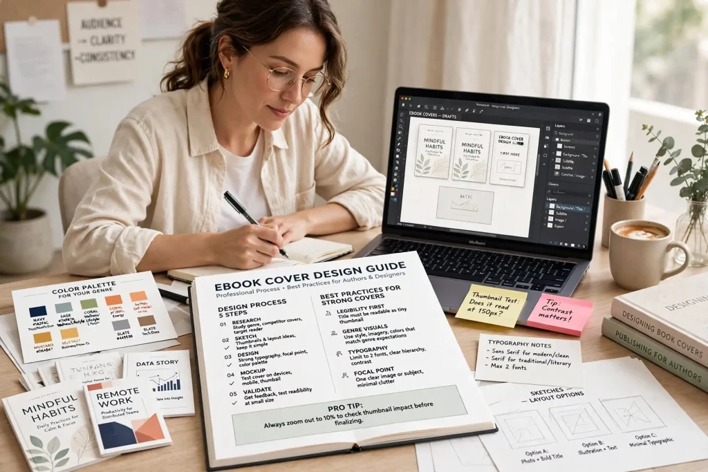
Most authors approach ebook cover design as if the covers will be viewed at full size. They evaluate designs at the size they appear in design software, where every detail is visible and every nuance reads clearly. The reality of ebook cover design is that most reader interactions with covers happen at thumbnail size, where covers appear as small images in search results, category pages, and recommendation lists. The cover that looks brilliant at full size can fail completely at thumbnail size if the design wasn’t optimized for small display. Authors who design specifically for thumbnail performance tend to produce ebook covers that actually compete for reader attention.
This post walks through why thumbnail visibility drives ebook sales, the specific design choices that work at small sizes, and how to test your covers at the sizes that actually matter.
Why Thumbnails Drive Ebook Sales
Most ebook discovery happens at thumbnail size rather than full cover view.
The search results experience. When readers search on Amazon, results display as small cover thumbnails. The cover gets less than a second of attention in this view.
The category browsing experience. Category pages display covers in grid layouts at small sizes. Readers scan dozens of thumbnails looking for what catches their attention.
The also-bought recommendations. Recommendation sections show covers at small sizes. Cross-promotion between books depends on thumbnail effectiveness.
The mobile reading experience. Most ebook discovery now happens on mobile devices where covers appear even smaller than on desktop browsers.
The promotional email experience. Newsletter promotions show covers at small sizes within email layouts.
The social media sharing context. When books appear on social media, covers often display at small thumbnail sizes.
Each of these contexts shows covers at sizes much smaller than the cover designer typically reviews. Covers that succeed at full size but fail at thumbnail size produce poor discovery results regardless of how good they look at full review.
The Thumbnail Size Reality
Specific sizes matter for thumbnail effectiveness.
Amazon search results thumbnail. Approximately 100 x 150 pixels in standard search displays. Smaller on mobile interfaces.
Amazon category page thumbnails. Similar small sizes in category grid displays.
Amazon ad creative thumbnails. Even smaller in some ad placements.
Email newsletter thumbnails. Around 80 x 120 pixels in many newsletter templates.
Social media thumbnails. Variable but typically small in feed displays.
Mobile interface thumbnails. The smallest displays, often 60 x 90 pixels or smaller.
Design that works at these sizes requires specific choices that differ from design that works at full cover review size. Authors who design only for review size produce covers that fail in the actual discovery contexts.
Text Sizing for Small Display
Text on ebook covers needs specific sizing considerations for thumbnail readability.
Title typography sizing. The title needs to be readable at 100 x 150 pixel thumbnail size. Many covers have titles too small to read at thumbnail.
Subtitle considerations. Subtitles often disappear completely at thumbnail size. Strong covers either make subtitles bold enough to read or accept that they won’t show at thumbnail.
Author name treatment. Author names should be readable but typically smaller than titles. The hierarchy should remain clear at thumbnail size.
Font weight selection. Bold fonts read better at small sizes than light or regular weights. Cover typography choices should account for this.
Font style implications. Highly stylized fonts often become illegible at thumbnail sizes. Cleaner fonts maintain readability better.
Color and contrast for text. Text needs strong contrast with backgrounds to remain readable at small sizes. Subtle color choices that work at full size often disappear at thumbnail.
Test by viewing your cover at 100 x 150 pixels. Can you read the title? If not, the cover fails in the most important discovery context regardless of how good it looks otherwise.
Contrast for Thumbnail Readability
Contrast becomes more important at small display sizes.
Background-to-text contrast. Text needs to stand out clearly from backgrounds. Low-contrast covers lose readability at thumbnail.
Color value separation. Even covers with similar color values can have insufficient contrast. The brightness difference between elements matters significantly.
Cover-against-platform background contrast. Covers also need to stand out against the platform background colors. White backgrounds on Amazon work differently than dark backgrounds on other platforms.
Edge definition. Cover elements need clear edges that survive at small display. Soft fades and gradients sometimes lose definition.
Focal point clarity. Strong covers have clear focal points that survive at any size. Cluttered covers without clear focus fail at thumbnail.
Visual hierarchy preservation. The hierarchy that organizes the cover at full size needs to remain at thumbnail size. Random emphasis confuses readers at small display.
Authors testing contrast at thumbnail sizes often discover that designs they thought worked actually have hidden contrast problems that limit thumbnail effectiveness.
Simplicity as Strategy
Simple covers usually outperform complicated covers at thumbnail size.
The element count consideration. Covers with five or more distinct visual elements often fragment at thumbnail. Two or three strong elements typically work better.
The detail level question. Fine details disappear at thumbnail size. Bold simple elements remain visible.
The composition focus. Strong covers focus attention. Scattered compositions don’t survive size reduction.
The color palette restraint. Covers using two or three dominant colors typically work better at thumbnail than covers with many colors.
The typography simplicity. One or two fonts work better than three or more fonts at thumbnail sizes.
The image complication. Highly detailed images often work less well at thumbnail than simpler imagery.
Strong ebook cover design embraces simplicity as deliberate choice rather than aesthetic preference. The simplicity supports thumbnail effectiveness directly.
Color at Small Scale
Color choices behave differently at thumbnail sizes than full cover sizes.
Bold colors attract attention at small sizes. Subtle color choices may disappear into platform background colors.
High saturation colors remain visible. Muted colors can become indistinguishable at small sizes.
Color combinations that create contrast survive size reduction. Combinations that merge can fail at thumbnail.
Genre-appropriate color signaling. Colors signaling genre quickly affect thumbnail-stage purchase consideration significantly.
Cultural color associations matter. Different markets respond to different color choices.
Color that fights against the platform interface fails. Cover colors that clash with retailer interfaces lose effectiveness.
Authors testing color choices at thumbnail sizes often discover that color decisions that seemed sophisticated at full size actually limit effectiveness at the size that matters most.
Image Element Choices
What you put on the cover affects thumbnail performance.
Human figures and faces. Tend to attract attention but require careful execution. Detailed faces often lose distinction at thumbnail.
Iconic single objects. Often work well at thumbnail sizes. The object remains recognizable at small size.
Detailed scenes. Often fragment at thumbnail. Less visually effective than simpler approaches.
Abstract compositions. Can work but require careful execution. Generic abstract often disappears at thumbnail.
Pattern-based covers. Repeating patterns can work but need careful application.
Typography-only covers. Some genres support covers with no imagery, just typography. The approach can work strongly at thumbnail.
Each image element approach has thumbnail-specific considerations. Authors should evaluate these against actual thumbnail performance.
Testing at Actual Display Sizes
Testing covers at real discovery sizes catches issues that designer review misses.
The thumbnail size test. View your cover at exactly 100 x 150 pixels. Honest evaluation at this size reveals what readers actually see.
The mock listing test. Create a mock Amazon search results page with your cover among competitor covers at thumbnail size. Does yours stand out appropriately?
The mobile device test. View covers on actual phones, not just desktop browsers. Mobile display reveals issues desktop doesn’t.
The squint test. Squint at your cover so detail blurs. Does the overall impression still work? Strong covers survive the squint test.
The distance test. View covers at 10 feet away. Strong covers remain identifiable. Weak covers lose distinction.
The peripheral vision test. Glance at covers without focusing directly. Strong covers register through peripheral vision. Weak covers don’t.
Testing at thumbnail sizes is the single most important step many authors skip. The testing catches design problems that final approval at full size lets slip through.
Mobile vs Desktop Thumbnail Differences
Mobile and desktop interfaces display thumbnails differently.
Mobile typically smaller displays. Covers appear even smaller on phones than on desktop browsers.
Mobile typically faster scrolling. Less time per cover for attention capture.
Mobile typically vertical orientation. The viewing angle differs from desktop.
Mobile color rendering. Different devices render colors differently. iOS and Android may show covers slightly differently.
Mobile bandwidth considerations. Slower connections may display covers at even lower resolution temporarily.
Mobile gesture interaction. Tapping vs clicking creates different interaction patterns.
Most ebook purchasing now happens on mobile. Authors who design only for desktop viewing miss the majority context. Mobile-first thumbnail design produces better results than desktop-prioritized approaches.
Common Thumbnail Failures
Several specific patterns regularly produce thumbnail failures.
Subtitle invisibility. Subtitles that disappear completely at thumbnail. Strong cover should still communicate without subtitle.
Title illegibility. Title text too small or too low contrast to read. The most damaging thumbnail failure.
Cluttered composition. Multiple competing elements that fragment at thumbnail.
Wrong genre signaling at small size. Genre conventions that don’t survive size reduction.
Lost focal point. Strong focal point at full size that becomes unclear at thumbnail.
Color fading. Color choices that work at full size but fade at thumbnail.
Detail loss. Important details that become invisible at small sizes.
Edge definition loss. Soft edges that lose clarity at thumbnail.
Author name dominance. Author names too prominent for new authors at thumbnail. Should support not dominate.
Background dominance. Backgrounds that overwhelm content elements.
Thumbnail Strength as Ebook Sales Driver
The thumbnail effectiveness of your ebook cover affects every aspect of digital book discovery. Books with strong thumbnails get clicked in search results. Get noticed in category browsing. Get attention in recommendation sections. Get clicks in promotional emails. Every discovery context where ebooks compete favors covers that work at small display sizes.
Authors who design specifically for thumbnail performance tend to produce ebook covers that compete effectively in the digital marketplace. Authors who design only for full-size review often produce covers that look good in portfolios but fail in actual discovery. The discipline of designing for thumbnail visibility involves specific choices that may feel limiting compared to designing for full review. The text gets larger. The composition gets simpler. The color choices get bolder. The hierarchy gets clearer. Each design constraint serves the practical reality of how readers actually encounter ebook covers in their book buying contexts. Authors who embrace these constraints rather than fighting them produce covers that drive the discovery that ebook sales depend on. The investment in thumbnail-effective design pays back across every reader who finds your books through the digital discovery paths that dominate modern book buying.


