
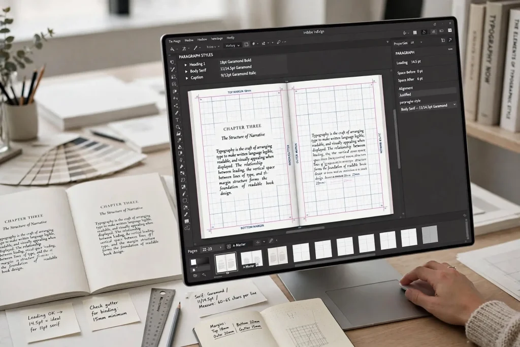
Most authors don’t realize that there’s a specific craft called typesetting that happens between manuscript completion and a finished book interior. They use terms like “formatting” or “layout” interchangeably without knowing that typesetting refers to a specific technical discipline with its own conventions, tools, and trained practitioners. The book typesetting explained at the level of what typesetters actually do reveals why some books read smoothly across hundreds of pages while others feel jarring even when readers can’t articulate why. The work is detailed, technical, and almost invisible when done well.
This post walks through what typesetters actually do, the specific technical operations involved, and how the craft produces book interiors that feel professional in ways that automated tools often miss.
What Typesetters Actually Do
Typesetting is the practical work of arranging type for printing or display. It’s the technical execution of typographic decisions across every page of a book.
The work includes selecting and configuring fonts for body text, headings, and other elements, setting margins and page geometry for the chosen trim size, configuring line spacing, paragraph indentation, and other text flow parameters, handling page break decisions across the entire book, managing widows and orphans through manual adjustment when automated handling fails, applying optical adjustments to specific letter pairs and spacing relationships, designing chapter openings and other special pages, integrating images, captions, and other non-text elements, and creating final production files for print and ebook output.
This is craft work. Each book presents specific challenges that require judgment calls based on training and experience. Automated tools handle many decisions but the edge cases where automation fails are exactly where skilled typesetters earn their keep.
A book interior produced by a skilled typesetter feels different from a book produced by software defaults alone. Readers don’t consciously notice the difference but their reading experience reflects it.
The Difference Between Typesetting & Formatting
The terms get used interchangeably but they refer to different work.
Formatting in common usage. The technical preparation of files for specific platforms. EPUB validation. PDF creation at correct trim size. File specifications meeting platform requirements. This is the file engineering side.
Typesetting in traditional usage. The visual arrangement of type on pages. Font selection. Spacing decisions. Page composition. Handling of widows and orphans. This is the design craft side.
The work overlaps significantly in modern publishing. The same person often handles both formatting (file engineering) and typesetting (visual design). But the underlying disciplines are distinct.
When authors hire “a formatter,” they typically get someone who handles the technical file preparation. When authors hire “a typesetter,” they typically get someone with deeper craft expertise in the visual arrangement work.
For most indie authors using tools like Vellum or Atticus, automated typesetting handles most decisions reasonably well. For authors who want truly professional results, working with a skilled typesetter (or learning the craft yourself) produces better outcomes.
Font Selection & Configuration
The first typesetting decision is which fonts to use and how to configure them.
Body text font selection. Most professionally typeset books use serif body text fonts that have been proven readable across long reading sessions. Garamond, Caslon, Sabon, Minion Pro, and similar fonts work well.
Body text size and leading. Body text typically runs 10 to 12 point with 13 to 16 point leading. The specific values depend on the chosen font and target audience.
Heading font selection. Headings can use the same font family as body text at larger sizes, or contrasting fonts that complement the body text. The choice affects the book’s overall character.
Heading hierarchy. Multiple levels of headings (chapter, section, subsection) each get distinct visual treatment that signals their position in the hierarchy.
Special character handling. Each font supports different glyph sets. Books with unusual characters (accented letters, math symbols, foreign language text) need fonts that support the required characters.
Font licensing verification. Fonts used in commercial books need appropriate licensing. Some fonts allow embedding in PDFs but not in EPUB files. The licensing needs verification before production.
Spacing & Text Flow
Beyond font selection, typesetters manage the spacing relationships that determine how text flows on each page.
Tracking and kerning. Tracking adjusts overall letter spacing across paragraphs or pages. Kerning adjusts spacing between specific letter pairs that look uneven at default settings. Skilled typesetters adjust these to improve readability and visual evenness.
Paragraph spacing. The space between paragraphs and the indentation of first lines. Standards vary by genre and book design.
Line spacing optimization. Beyond default leading, line spacing can be adjusted slightly to fix specific lines that look too tight or too loose.
Word and letter spacing in justified text. Justified text creates spacing variation across lines. Typesetters can adjust the maximum and minimum spacing values to prevent rivers (visible streaks of white space) running through the text.
Hyphenation control. Default hyphenation breaks words at standard linguistic points. Typesetters can override hyphenation for words that break awkwardly or that appear too frequently at line ends.
Hanging punctuation. Some typesetting traditions hang quotation marks and other punctuation slightly outside the main text block for cleaner visual edges. Optional but adds polish.
These adjustments are largely invisible to readers but the cumulative effect produces interiors that feel smoother to read.
Page Break Decisions
How text breaks across pages affects the reading experience significantly.
Widow control. A widow is the last line of a paragraph that ends up alone at the top of the next page. Widows look isolated and disrupt reading flow. Skilled typesetters adjust spacing or layout to prevent widows.
Orphan control. An orphan is the first line of a paragraph that gets stranded at the bottom of a page with the rest of the paragraph continuing on the next page. Like widows, orphans look isolated and unprofessional.
Page break optimization. The choice of where pages break can be controlled by adjusting text flow earlier in the page. Typesetters look ahead through the book and make adjustments that produce better page breaks throughout.
Dialogue break handling. Breaking dialogue across pages can confuse readers. Typesetters often adjust spacing to keep dialogue exchanges together when possible.
Section break placement. Within chapters, scene breaks can be styled in different ways. Typesetters apply consistent styling and consider how breaks fall on pages.
Avoiding awkward breaks. Some text shouldn’t break across pages. Important quotations. Short sections. Specific phrases that lose meaning when split. Typesetters identify these and adjust to prevent the breaks.
The cumulative effect of careful page break work is a book that reads smoothly across hundreds of pages without the visual stutters that interrupt reader flow.
Chapter Opening Design
Chapter openings are where typesetting craft becomes most visible.
Page placement. Chapter openings traditionally start on recto (right-hand) pages. Some books use the next available page regardless. The choice affects the book’s character.
Drop space at top. Body text on chapter opening pages typically starts further down the page than on regular pages. The amount of drop space affects how the chapter feels to enter.
Chapter title styling. Type size, weight, color, and font choice for chapter titles establish the visual character. Decisions made for one chapter need to be applied consistently to all chapters.
Drop caps. Many books use large opening letters (drop caps) for the first letter of each chapter. The size, font, and exact positioning of drop caps require careful attention.
Small caps for opening words. Some books style the first few words of each chapter in small caps for visual emphasis. The number of words, the styling, and the consistent application all need careful handling.
Ornaments and decorative elements. Some books add visual ornaments at chapter openings. The choice and application of these elements contributes to the book’s character.
Each of these decisions interacts with the others. Typesetters consider the chapter opening as a complete composition rather than a collection of separate decisions.
Integration of Images & Other Elements
For books with images, captions, or other non-text elements, typesetting work expands significantly.
Image placement decisions. Where images appear in relation to the text they accompany. Same page if possible. Following page if not. Never wildly separated from their referenced text.
Image sizing and proportions. How large images appear on the page. Maintaining proper aspect ratios. Cropping when needed to fit the page geometry.
Caption styling. The text that describes images needs styling that complements but doesn’t compete with body text. Smaller size, often italic, sometimes different font family.
Pull quotes and sidebars. For nonfiction with these elements, typesetting handles the visual integration with surrounding text.
Footnotes and endnotes. Reference notes need careful styling and consistent placement (bottom of page for footnotes, end of chapter or book for endnotes).
Tables. Tables in books require specific typesetting attention to maintain readability across different table sizes and column arrangements.
Each non-text element requires both individual styling decisions and integration with the overall book design.
Production File Output
The final typesetting work produces the files that get sent to printers and platforms.
Print PDF production. The PDF must meet specific technical requirements for the chosen print provider. CMYK color mode. Embedded fonts. Proper bleeds. Correct trim size. Color profiles matched to print specifications.
EPUB production. The EPUB file must validate cleanly through EPUBCheck. Heading tags applied for proper table of contents generation. Image embedding handled correctly. CSS styling that renders well across reading apps.
Format-specific decisions. Some typesetting decisions need different handling for print versus ebook. Chapter opening drop caps work in print but render differently in ebook. Page numbering doesn’t exist in reflowable ebooks. The typesetter considers these differences during production.
Quality control. Print and ebook outputs both need testing before publication. Proof copies for print. Reading on multiple devices for ebook. Issues found during quality control trigger revision rounds.
Common Typesetting Mistakes
Several patterns produce books that signal amateur typesetting.
Default settings throughout. Books produced entirely with software defaults often work acceptably but rarely produce the polish that careful typesetting provides.
Inconsistent treatment. Chapter openings that vary slightly across the book. Heading styles applied inconsistently. The variations look like mistakes.
Poor widow and orphan control. Single lines stranded at page boundaries. Tools handle this automatically with default settings but edge cases need manual attention.
Wrong margins for trim size. Books with margins that don’t suit their physical dimensions feel cramped or excessive. Standard templates work but adjustments often improve specific books.
Skipping kerning adjustments. Some letter pairs in some fonts kern badly at default settings. Display type particularly often needs manual kerning for clean appearance.
Mismatched fonts. Body and heading fonts that don’t complement each other visually. The mismatch undermines the book’s overall design.
Wrong dash usage. Em dashes, en dashes, and hyphens have specific uses. Mixing them up signals lack of typographic knowledge.
Improper ellipses. Three periods (…) versus the proper ellipsis character (…). The proper character is standard in professional typesetting.
Why Typesetting Is Worth Treating Seriously
The typesetting work happens behind the scenes. Readers don’t consciously notice the difference between a carefully typeset book and one produced with software defaults. They just notice that one reads more smoothly than the other without being able to explain why.
The investment in proper typesetting (either learning to do it yourself or hiring skilled help) produces returns across every reader who picks up the book. Better reviews. Higher reread rates. More referrals to other readers. The compound effect across thousands of copies and years of catalog life justifies the work many times over.
Authors who treat typesetting as a serious craft tend to produce books that compete visually with traditional publishing output. Authors who treat it as automated paperwork often produce books that signal amateur production even when the writing itself is strong. The craft is learnable and the tools are accessible. Each book typeset carefully becomes a book that signals professional production to every reader who opens it, for as long as the book stays in print.


