
Most authors approach typography decisions intuitively. They pick fonts that look nice in a quick preview, set sizes that seem reasonable, and trust software defaults for everything else. The result is books that work technically but rarely produce the reading experience that thoughtful typography would produce. The typography book design question matters because typography decisions affect how readers experience your work across hundreds of pages, and the principles that produce good typography are knowable rather than mysterious.
This post walks through the design principles that guide typography decisions, why certain choices work better than others, and how to think about type as a system of relationships rather than isolated choices.
Typography Is About Relationships
The first principle of book typography is that nothing happens in isolation. Every typographic decision relates to every other decision.
The body text font relates to the heading font. They either complement each other (producing visual harmony) or compete with each other (producing visual noise).
The text size relates to the line length and the page width. Type that’s too large for the line length produces awkward breaks. Type that’s too small for the page produces tiring reading.
The leading (line spacing) relates to the type size. Too tight and lines crowd each other. Too loose and the eye loses its place between lines.
The margins relate to the text block. Generous margins frame the text comfortably. Cramped margins make the text feel pressured.
Strong typography emerges from getting the relationships right rather than picking individual elements that look good in isolation. Authors who think about typography as a system of choices produce better results than authors who treat each decision separately.
The Hierarchy Principle
Books have multiple levels of text that serve different functions. Strong typography uses visual hierarchy to signal these levels clearly.
Body text is the visual baseline. It’s where readers spend their time. The body text style anchors everything else.
Chapter titles sit at the top of the hierarchy. They appear in clearly larger or differently styled type that signals their position. Readers find them instantly when scanning.
Section headings (within chapters, for nonfiction) sit between chapter titles and body text. They use sizing or styling that distinguishes them from body text without competing with chapter titles.
Subsection headings (deeper levels in nonfiction) sit between section headings and body text. They’re distinct from both but not so prominent that they pull focus from section headings.
Captions, sidebars, footnotes, and other special elements each get their own positions in the hierarchy.
The hierarchy works through consistent application of size, weight, and styling differences. Readers learn the hierarchy implicitly within the first few pages and use it to find their way through the book.
Mismatched hierarchy (section headings larger than chapter titles, captions sized like body text) confuses readers and undermines the book’s usability.
Font Pairing Logic
When books use multiple fonts (typically one for body text and one for headings), the pairing logic affects the overall design quality.
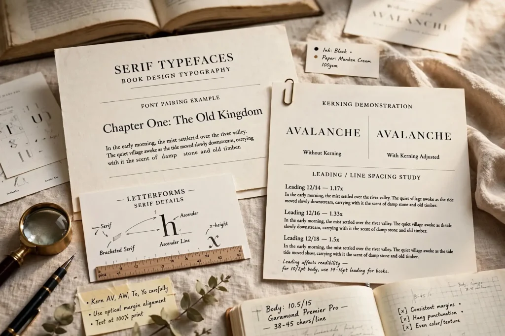
Contrast principle. Effective font pairings show clear contrast between the fonts. Serif body text with sans-serif headings creates contrast. Two different serif fonts at the same weight don’t.
Complement principle. Despite the contrast, the fonts should feel like they belong together. Both should signal similar genre conventions. Both should have compatible proportions.
Common pairing patterns. A traditional pairing uses a serif body text (Garamond, Caslon, Sabon) with a sans-serif heading font (Avenir, Futura, Source Sans). The body text provides reading comfort. The headings provide visual variety.
Same-family pairings. Some fonts come in matched serif and sans-serif versions designed specifically to pair with each other. Source Serif and Source Sans. Lyon and Lyon Sans. These pairings work reliably.
Avoiding common mistakes. Two similar fonts that aren’t quite the same look like a mistake. Two highly contrasting fonts that don’t share design heritage feel jarring. Default font pairings (whatever Word offers) usually look generic.
For most fiction, a single font family used at different sizes and weights works well. Headings can simply be the body text font at larger sizes with bold weight. The simplicity often produces stronger results than involved pairings.
Body Text Sizing Principles
Body text size is the most consequential typographic decision in any book.
Standard ranges. Body text typically runs 10 to 12 point for adult fiction and nonfiction. Below 10 point becomes tiring for most readers. Above 12 point looks juvenile for adult content.
The exact size depends on the font. Different fonts have different apparent sizes at the same point measurement. 11 point Garamond looks different from 11 point Caslon.
Line length affects optimal size. The classic rule of 50 to 75 characters per line works well for body text. Books with shorter lines can support smaller type. Books with longer lines often need larger type.
Reading distance matters. Adult readers typically hold books 12 to 18 inches from their eyes. Type sized for this distance works well in most cases.
Age of target audience. Older readers often appreciate slightly larger body text. Books targeting older audiences (memoir, certain nonfiction) sometimes use 12 point body text where younger-targeted books would use 11 point.
Test before committing. Print a sample chapter at your chosen size and read it for an hour. Issues that aren’t visible on screen often become obvious in extended print reading.
Leading & Spacing Principles
Beyond font size, the spacing between lines (leading) affects readability significantly.
Standard leading ranges. Body text leading typically runs 1.3x to 1.5x the type size. For 11 point body text, leading of 14 to 17 points works well.
Tighter leading saves space. Books with high page counts sometimes use tighter leading to keep the book length manageable. Tight leading sacrifices readability for compactness.
Looser leading improves readability. Books that prioritize reading comfort over page count use slightly looser leading. The trade-off is more pages but smoother reading.
Paragraph spacing. The space between paragraphs and the indentation of first lines. Standards vary by genre. Most fiction uses indented paragraphs without extra spacing. Most nonfiction uses spaced paragraphs without indentation.
White space around chapter openings. Chapter openings benefit from generous white space above and below the title. The breathing room makes chapter openings feel important.
Letter spacing (tracking). Small adjustments to overall letter spacing can fine-tune readability. Display type often benefits from slightly tighter tracking. Body text usually works best at default tracking values.
Creating Visual Rhythm
Strong typography creates a visual rhythm that readers experience without consciously noticing it.
Consistent body text texture. Body pages should have visually consistent texture from chapter to chapter. The same font, size, spacing, and alignment produce uniform texture that doesn’t distract.
Punctuation rhythm. The placement of paragraph breaks, dialogue, and section breaks creates a visual rhythm. Books with appropriate variation feel more dynamic than books with uniform paragraph density.
Chapter opening as visual punctuation. Chapter openings break the rhythm of body pages with their distinct visual treatment. The variation refreshes reader attention.
Spread balance. The two facing pages visible when the book is open work together visually. Spreads that feel balanced (similar visual weight on both pages) feel comfortable to read. Lopsided spreads (one heavy, one light) feel intentional only at chapter breaks.
These rhythm elements work below conscious awareness for most readers. But the cumulative effect significantly affects reading experience.
Common Typography Mistakes
Several patterns regularly produce books with weak typography.
Default fonts throughout. Microsoft Word’s default Calibri or Times New Roman signal amateur production. Even basic substitutions improve the result.
Wrong dash usage. Em dashes, en dashes, and hyphens have specific uses. Mixing them up signals lack of typographic knowledge.
Improper quotation marks. Books use curly quotes (” “) not straight quotes (” “). Software often converts automatically but verification is worth the time.
Improper ellipses. Three periods versus the proper ellipsis character. The proper character is standard.
Wrong font sizes. Type that’s too small or too large for the trim size and target audience. Test before committing.
Inconsistent hierarchy. Headings that vary in styling across the book. Each level of heading should look the same every time it appears.
Random font choices. Picking fonts based on what looks nice in a preview without considering how they’ll read at body text sizes across hundreds of pages.
Overuse of italics. Italics for emphasis work when used sparingly. Italics for thoughts work in some genres. Italics applied randomly throughout the text lose their visual effect.
Type Decisions That Carry Across Every Book
The typography decisions you make on your first book typically shape how readers experience your work for years afterward. The font choices, sizing decisions, and design relationships you establish early become the visual identity that runs across your catalog. Authors who think carefully about typography on book one tend to produce catalogs that feel cohesive across multiple titles. Authors who pick typography casually for book one often find themselves either stuck with weak choices across their catalog or expensive redesigns later when they realize the original choices weren’t strong.
The principles that guide good typography aren’t a mystery. They’ve been understood for centuries. The work to learn them once pays back across every book you publish for the rest of your career. The tools to apply the principles are accessible. The skilled help is available when you don’t want to learn it yourself. What separates books with strong typography from books with weak typography isn’t budget or talent. It’s the decision to treat typography as worth thinking about rather than worth defaulting through.


