
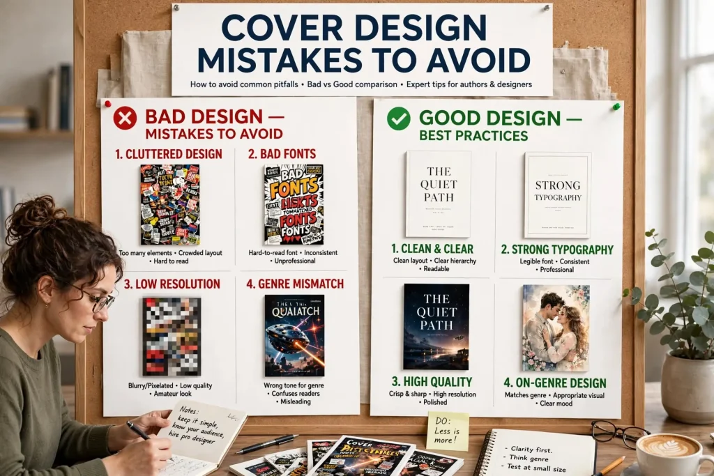
Most failed book covers fail through specific recurring mistakes rather than through random aesthetic problems. The same mistakes appear across thousands of amateur covers in ways that experienced designers and serious readers recognize instantly. The book cover mistakes that consistently kill sales aren’t matters of taste or genre preference. They’re identifiable patterns that signal amateur production regardless of how the author or designer feels about the result. Authors who learn to recognize these mistakes can avoid them in their own covers and evaluate cover design work more effectively.
This post walks through the specific cover design mistakes that consistently produce weak commercial results, why each mistake matters, and how to avoid them in your own book covers.
Typography Mistakes That Signal Amateur Work
Cover typography is one of the most visible indicators of professional versus amateur design. Several specific typography mistakes appear repeatedly on weak covers.
Wrong fonts for the genre. Each genre has typography conventions that work. Romance covers use certain font families. Thrillers use different ones. Literary fiction uses still others. Covers using fonts from wrong genre conventions immediately signal mismatch.
Too many fonts. Strong covers typically use one or two font families across all text elements. Covers using three, four, or more different fonts feel chaotic and amateur.
Default software fonts. Comic Sans, Papyrus, Brush Script, and other default fonts that come with consumer software regularly appear on amateur covers. These fonts have specific aesthetic associations that almost never match book design needs.
Wrong font weight. Titles in light weights when bold is needed. Subtitles in heavy weights when something more delicate would work. Font weight choices significantly affect how text reads at thumbnail sizes.
Insufficient title contrast. Title text that disappears against the background at thumbnail sizes. The title needs to be readable at small sizes where most discovery happens.
Bad letter spacing. Default letter spacing rarely produces optimal results. Strong typography requires manual adjustment of letter spacing, particularly for title treatment.
Inappropriate font effects. Drop shadows, bevels, glows, and 3D effects often appear on amateur covers. These effects rarely improve professional design and frequently signal lack of sophistication.
Stretched or compressed type. Text that’s been stretched or compressed to fit available space. The distortion damages the typography’s intentional design.
Image Mistakes That Damage Covers
Beyond typography, image choices significantly affect cover effectiveness.
Generic stock photography. The same stock photos appear on multiple unrelated book covers. Readers recognize the imagery as generic. Custom imagery or carefully selected less-common stock works better.
Low-resolution images. Pixelated or blurry images at thumbnail sizes signal poor production. Images need to be high enough resolution to look clean at print size.
Wrong-genre imagery. Cover imagery that doesn’t match the book’s genre confuses readers about what the book actually is. Romance imagery on thrillers. Thriller imagery on literary fiction.
Cluttered composition. Too many visual elements competing for attention. Strong covers have clear focal points. Cluttered covers don’t.
Bad photo manipulation. Obviously photoshopped elements that don’t fit together properly. Skin tones that look unnatural. Composite images where the integration is visibly poor.
Wrong image quality for the genre. Photorealistic images on books that should have illustrated covers. Illustrated covers on books that should have photographic treatment. The medium choice should match genre expectations.
Cropping problems. Important visual elements cropped at awkward positions. Faces partially cut off. Hands or feet appearing without bodies they should belong to.
Royalty-free image overuse. The most popular royalty-free images appear on hundreds or thousands of products. Authors using these images produce covers that look generic.
Watermarked images. Stock images with watermarks still visible because the author didn’t license them properly. Both legally and visually problematic.
Color Mistakes That Hurt Sales
Color choices affect commercial reception significantly.
Wrong colors for the genre. Each genre has color conventions. Romance covers tend warm. Thriller covers tend dark. Mismatch confuses buyers.
Too many colors. Strong covers usually limit themselves to 2 to 4 colors used purposefully. Covers using many colors often look chaotic and unfocused.
Bad color combinations. Colors that fight each other rather than complementing. Random color combinations rarely produce strong covers.
Insufficient contrast. Text that barely shows against backgrounds. Covers need contrast strong enough for thumbnail readability.
Garish saturation. Maximum-saturation colors across the cover. The brightness fights for attention rather than directing it. Restrained saturation usually outperforms.
Random color theme drift. Different color palettes used on different books by the same author. Inconsistency across the catalog damages brand recognition.
Default software colors. The exact colors that come standard in design software. These colors lack the intentional selection that professional design requires.
Inappropriate color for content. Light cheerful colors on serious content. Dark heavy colors on cheerful content. The color mood should match the book’s content.
Composition Mistakes That Reduce Impact
The arrangement of elements on covers significantly affects their effectiveness.
No clear focal point. Readers’ eyes don’t know where to look first. Strong covers direct attention purposefully. Weak ones leave it scattered.
Bad visual hierarchy. Important elements (title, author name) treated equally to less important elements. The hierarchy should be clear.
Centered everything. Center alignment of every element produces visually static covers. Strong covers typically use varied alignment to create visual interest.
Title too small. Titles small enough that they don’t read at thumbnail sizes. The title needs to dominate visually for most genres.
Author name too prominent. Author names larger than titles work for established bestsellers (Stephen King, Nora Roberts) but rarely for newer authors. New authors typically need title prominence over author name.
Empty white space without purpose. Large empty areas that don’t serve the composition. Different from intentional negative space that creates breathing room.
Cluttered margins. Important elements pushed against cover edges without breathing room. Strong covers have intentional margins around key elements.
Bad balance. Visual weight uneven in ways that don’t serve the design. Strong covers have intentional balance even when asymmetrical.
No clear direction. Compositions that don’t guide the eye anywhere. Strong covers direct viewing through composition decisions.
Genre Mismatch Mistakes
Beyond individual element problems, the overall genre signaling matters significantly.
Wrong style for genre. Literary fiction-style covers on commercial fiction. Commercial fiction covers on literary work. The mismatch confuses buyers.
Subgenre conventions ignored. Within larger genres, subgenres have specific conventions. Romantic suspense covers look different from contemporary romance covers. Books violating subgenre conventions struggle to find their audience.
Generic genre treatment. Covers that signal genre weakly. Romance covers that could be any kind of fiction. Mystery covers that don’t signal mystery clearly. Strong genre signaling supports discovery.
Outdated conventions. Some authors design to conventions that worked 10 years ago but don’t apply now. Periodic updating to current conventions matters.
Cross-genre confusion. Books that don’t clearly belong to any specific genre often produce covers that signal multiple genres weakly. Pick the primary genre and signal it clearly.
Beach read covers on serious content. Cheerful summery covers on books with significant heft. The treatment mismatch disappoints buyers.
Erotic-looking covers on non-erotic content. Cover imagery suggesting content significantly more sexual than the book actually contains. Sets buyer expectations that the book doesn’t meet.
DIY Cover Mistakes
Authors handling their own design make specific mistakes that experienced designers avoid.
Using Microsoft Word or PowerPoint. These applications aren’t designed for cover work. The output rarely looks professional.
Skipping proper design software. Strong covers typically come from Adobe Photoshop, Illustrator, or InDesign. Free alternatives like GIMP can work but require skill.
Not knowing print specifications. DIY covers often miss bleed, resolution, color profile, or other technical requirements.
Relying on default settings. Default fonts, default colors, default layouts. The defaults rarely produce professional results.
No design education. Visual design has principles that take time to learn. Authors handling their own design without studying principles often produce covers that violate basic design rules.
Skipping feedback. Authors who design their own covers and never get feedback from readers or designers often miss obvious problems.
Personal preference over market signals. Picking design choices based on what you like rather than what the genre needs.
Trying to do too much. Cramming every element you want into one cover. Strong covers know what to leave out.
Using personal photography. Photos you took yourself rarely have the production quality covers need. Professional photography or quality stock photography typically works better.
Production Quality Mistakes
Beyond design choices, technical production quality matters.
Wrong file format for distribution. JPEG when PNG is needed. RGB when CMYK is required. Specific platforms have specific requirements.
Inadequate resolution. Files that look fine on screen but pixelate when printed or scaled. Resolution should be tested at expected use sizes.
Compressed images that show artifacts. JPEG compression artifacts visible in the cover. Files should be saved at appropriate quality levels.
Missing print bleed. Print covers without bleed produce white edges on printed books. Bleed setup is essential for print.
Wrong dimensions. Files at wrong dimensions get rejected or print incorrectly. Each book size and format has specific dimension requirements.
Missing fonts in print files. Fonts not embedded in print files cause substitution issues. Fonts should be embedded or outlined before submission.
Bad color reproduction. Colors that look one way on screen and another in print. CMYK color space and proper color profiles help.
Inconsistent quality across formats. The ebook cover looks fine but the print cover has problems. Each format should be checked separately.
Branding Mistakes Across Books
For authors with multiple books, consistency mistakes damage long-term brand building.
Different design styles across catalog. Books that don’t look like they belong to the same author. The fragmentation damages brand recognition.
Inconsistent author name treatment. Author name in different positions, sizes, or fonts across different books. Should stay consistent.
No catalog visual planning. Covers designed individually without consideration of how they’ll appear together. The collection looks accidental.
Trend chasing across catalog. Each book following current trends while older books used different conventions. Catalogs look like geological layers.
No design system documentation. Authors who can’t articulate their visual standards struggle to maintain them across books. Written brand guidelines help.
Switching designers randomly. Different designers across different books produce different aesthetic outputs. Some consistency in designer choice produces better catalog coherence.
Avoiding the Patterns That Sink Sales
The specific mistakes covered in this post recur across thousands of weak covers. They’re not random aesthetic problems. They’re identifiable patterns that experienced eyes recognize instantly. Authors who learn to spot these patterns can produce significantly better covers by simply avoiding the most common errors.
The work to avoid these mistakes isn’t complicated. Use one or two fonts. Pick fonts that match your genre. Use proper resolution. Set up bleed correctly. Use color palettes that fit the genre. Create clear focal points. Match genre conventions. Test covers at thumbnail size. Most of the mistakes are matters of knowing what to avoid rather than achieving difficult positive outcomes. Authors who systematically avoid the common mistakes often produce covers that compete effectively against significantly more expensive professional design. The cover doesn’t need to be brilliant to succeed commercially. It needs to avoid the specific mistakes that mark amateur production. Doing that consistently across your catalog produces book covers that support rather than undermine your books’ commercial chances.


